
Anza Borrego Foundation
Anza Borrego Foundation is a nonprofit organization dedicated to supporting and preserving Anza-Borrego Desert State Park, the largest state park in California.
Through conservation efforts, educational programs, and community engagement, the foundation plays a vital role in protecting the park’s natural beauty while enhancing the visitor experience for generations to come.
Anza Borrego Foundation
Brand Strategy & Identity Marketing Collateral
The Brief
Anza Borrego Foundation needed a refreshed brand identity that would better reflect its mission, expand its reach, and create a more cohesive presence across both physical and digital touchpoints.
The goal was to develop a brand that felt approachable and engaging for visitors, while still maintaining the credibility and trust expected of a long-standing nonprofit organization.
THE CHALLENGEBalancing approachability with institutional credibility
As a nonprofit, the brand needed to feel trustworthy and established, but not outdated or overly formal. It had to resonate with a wide audience, from park visitors to donors and community partners.
Creating a cohesive system across diverse applications
The foundation operates across signage, merchandise, printed materials, and digital platforms. The identity needed to remain consistent and recognizable across all of these environments.
Capturing the spirit of the desert in a simple, scalable way
The visual identity needed to reflect the natural landscape, rugged, expansive, and iconic, without becoming overly complex or difficult to reproduce across formats.
THE STRATEGYRather than overcomplicating the identity, the strategy focused on creating a clear and recognizable visual language that reflects the landscape, wildlife, and mission of the foundation.
We positioned Anza Borrego Foundation as both a steward and storyteller—an organization that not only protects the park, but invites others to experience and care for it.
The identity was designed to feel grounded and accessible, while still carrying a sense of authority. This balance allows the brand to connect with casual visitors, engaged supporters, and long-term donors alike.
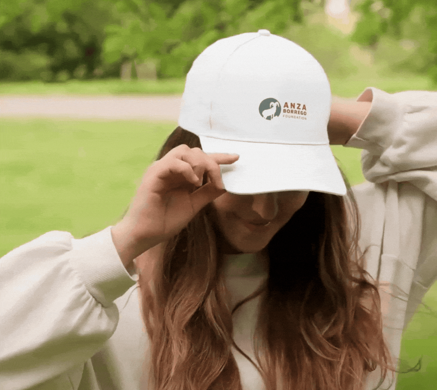
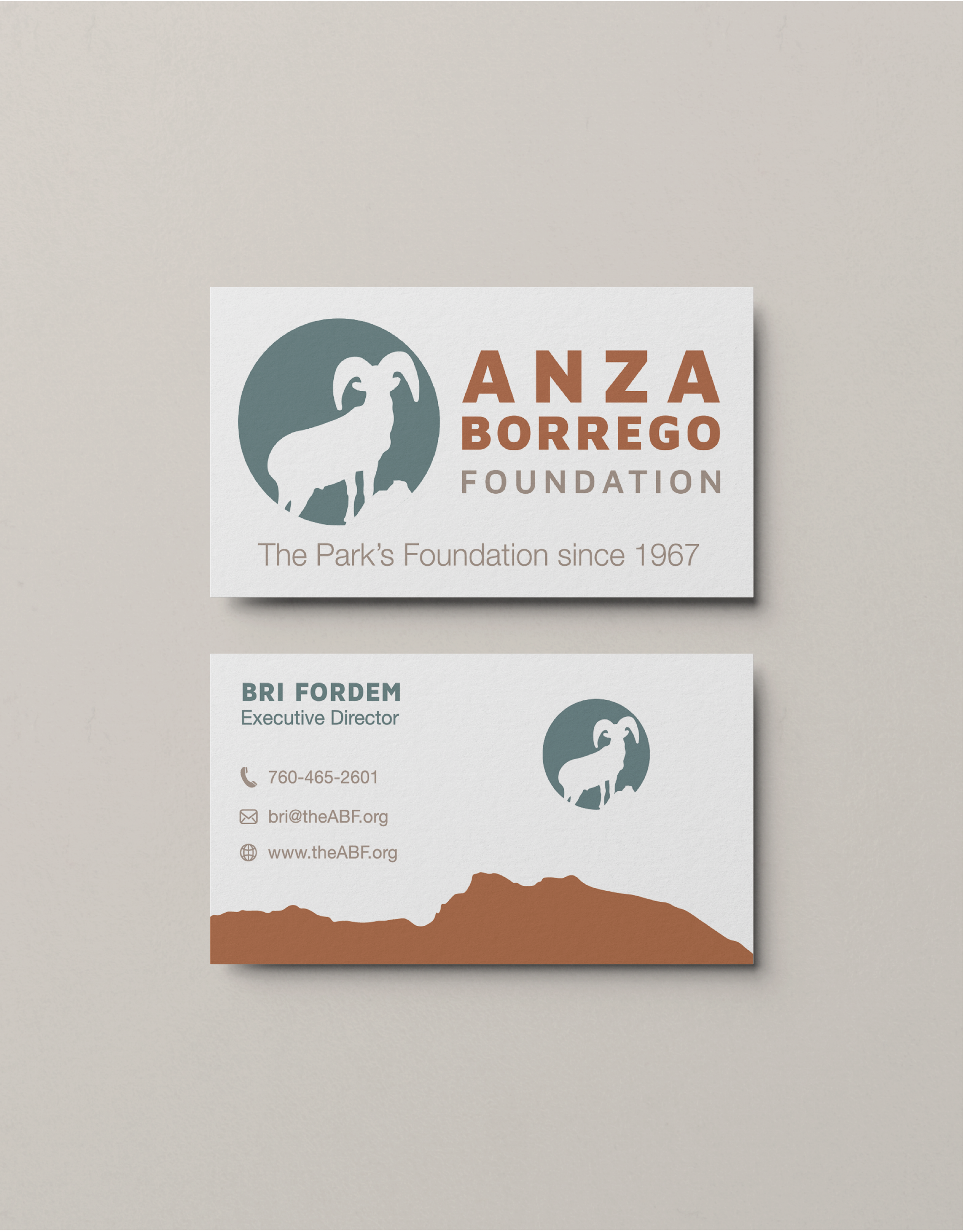
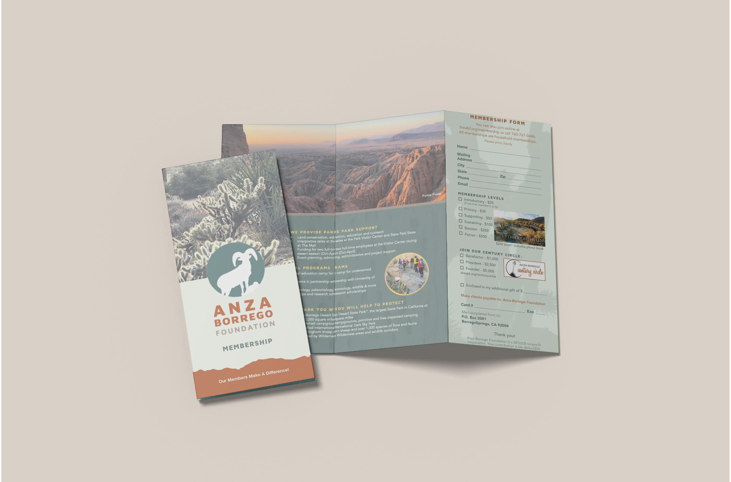
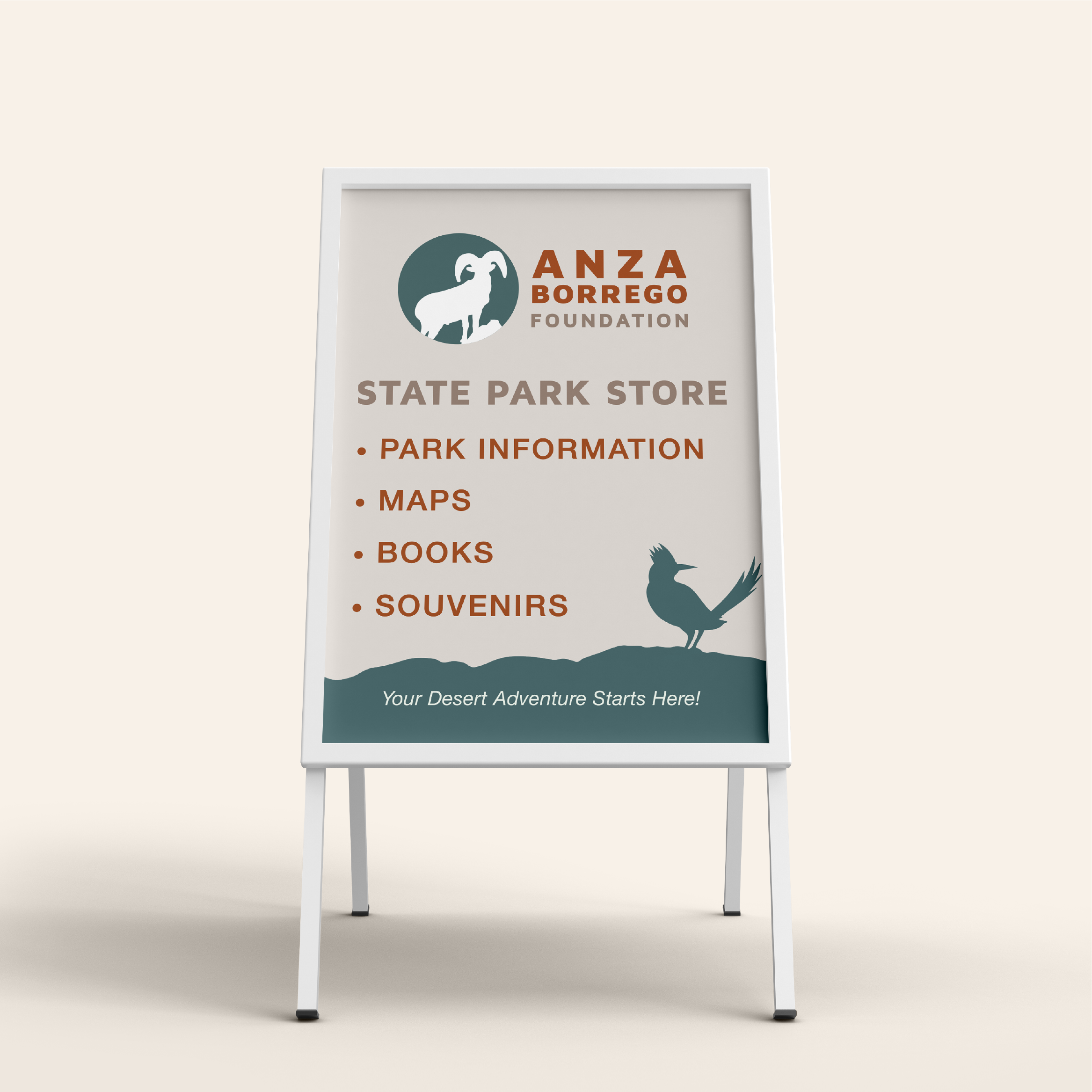
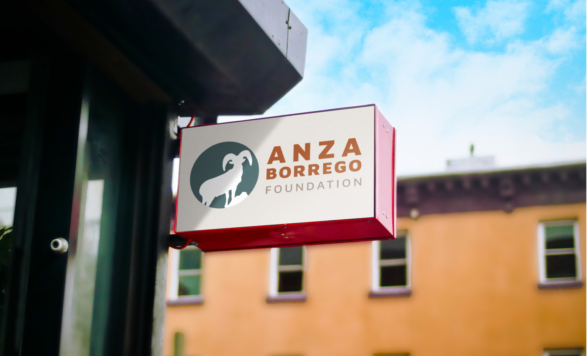
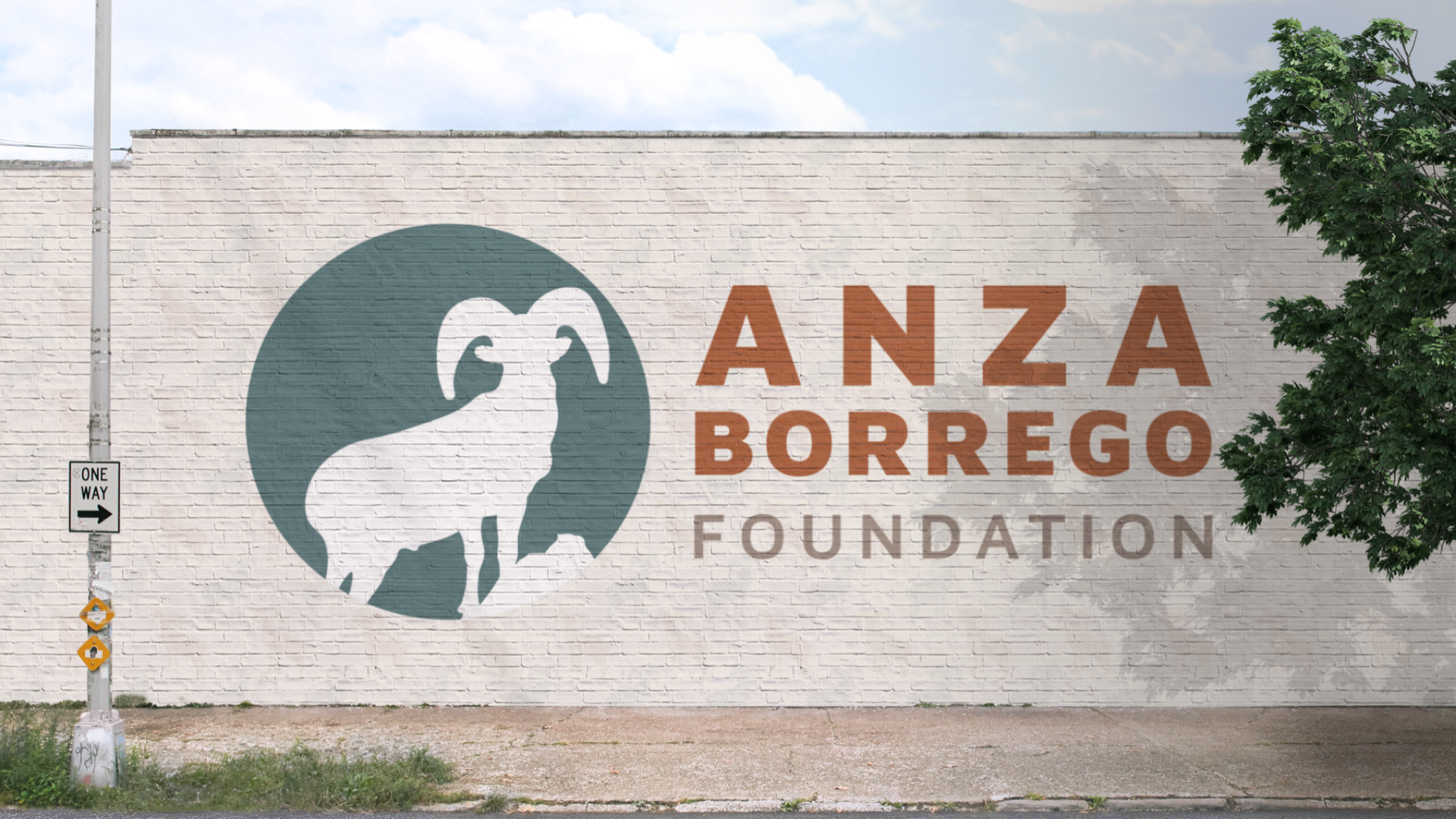
Clarity and consistency were key. Every element of the brand was built to scale across real-world applications, from signage and printed materials to merchandise and environmental graphics.
The brand was rooted in a simple idea: connection to place.
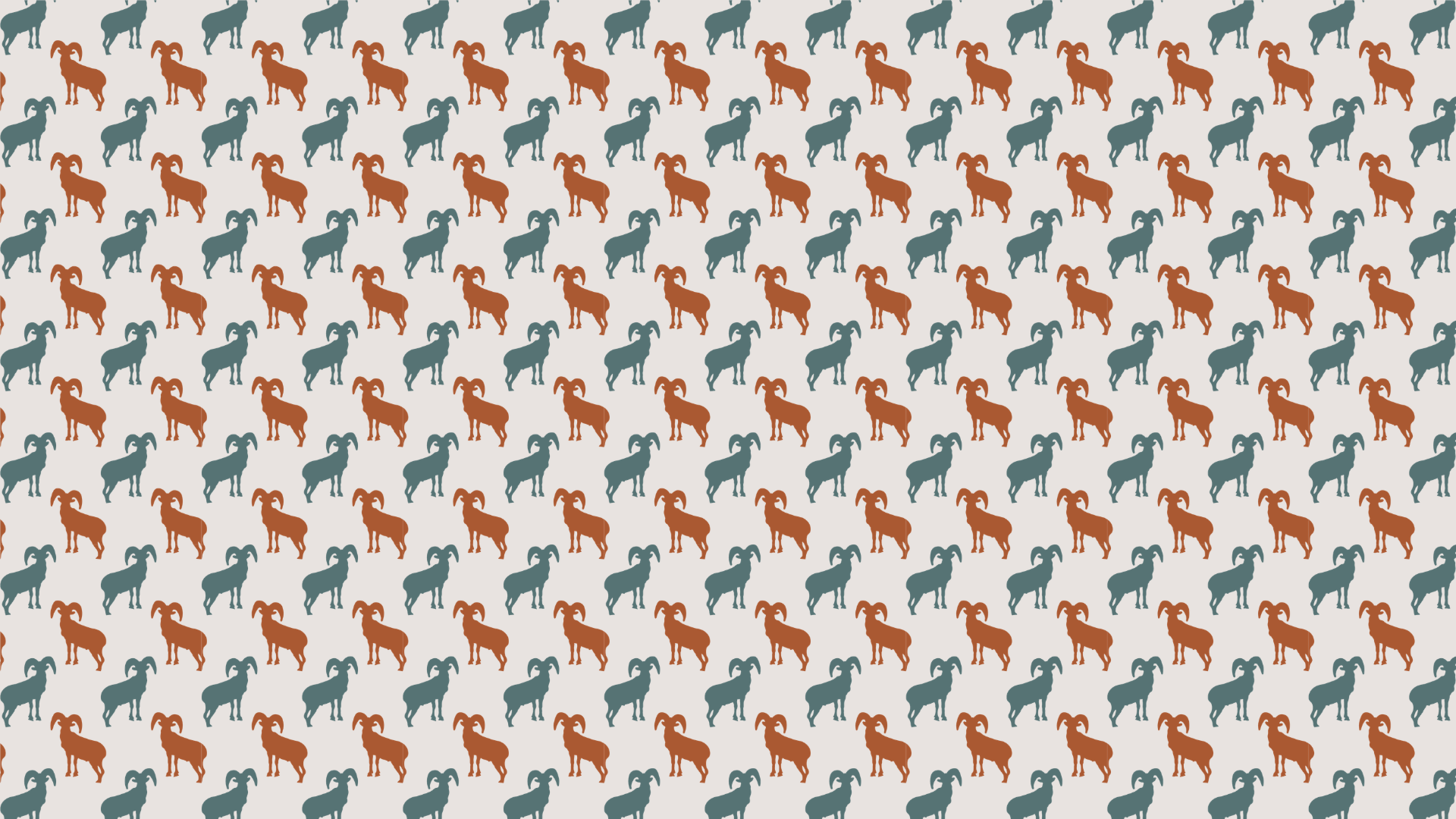
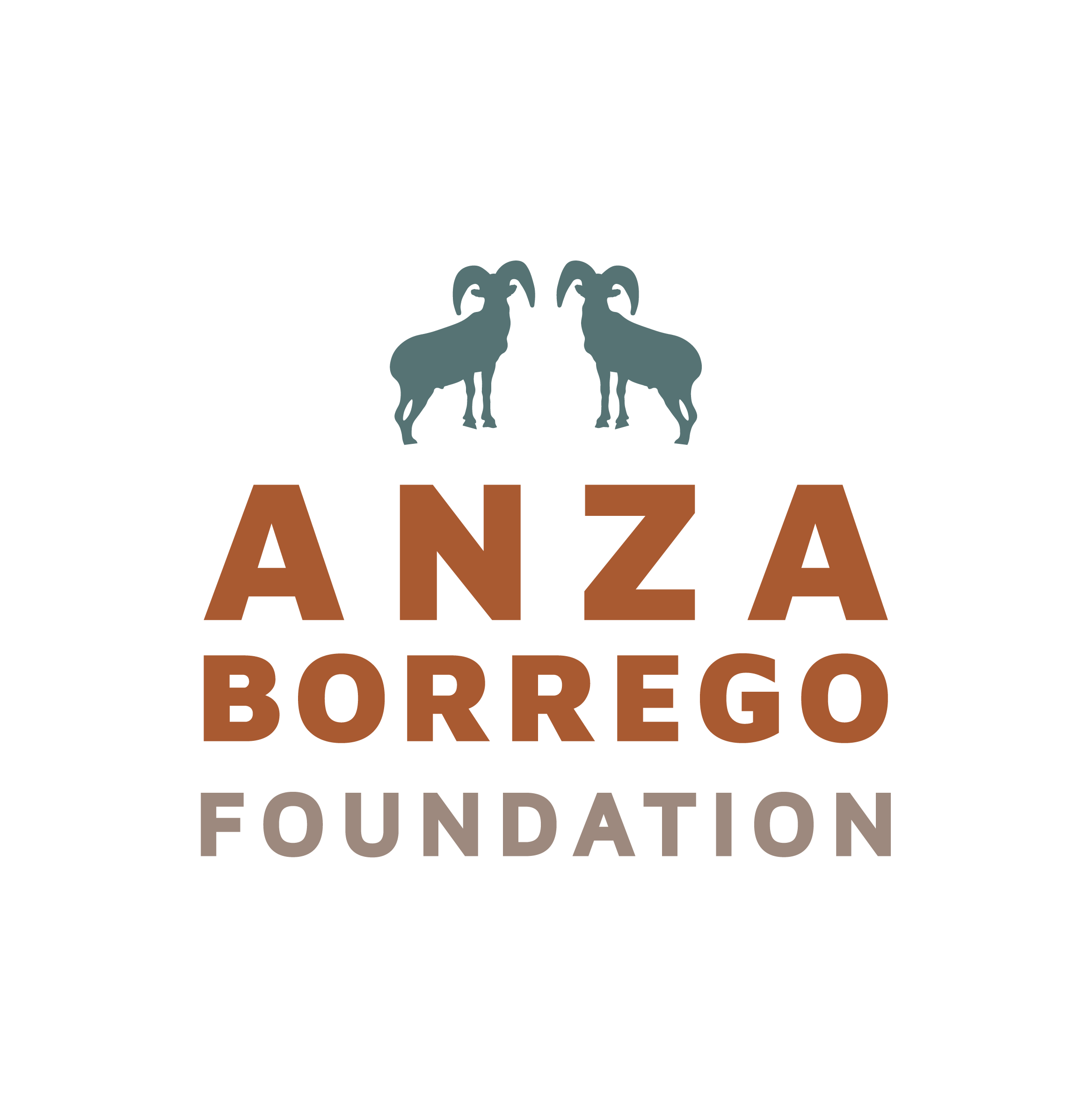
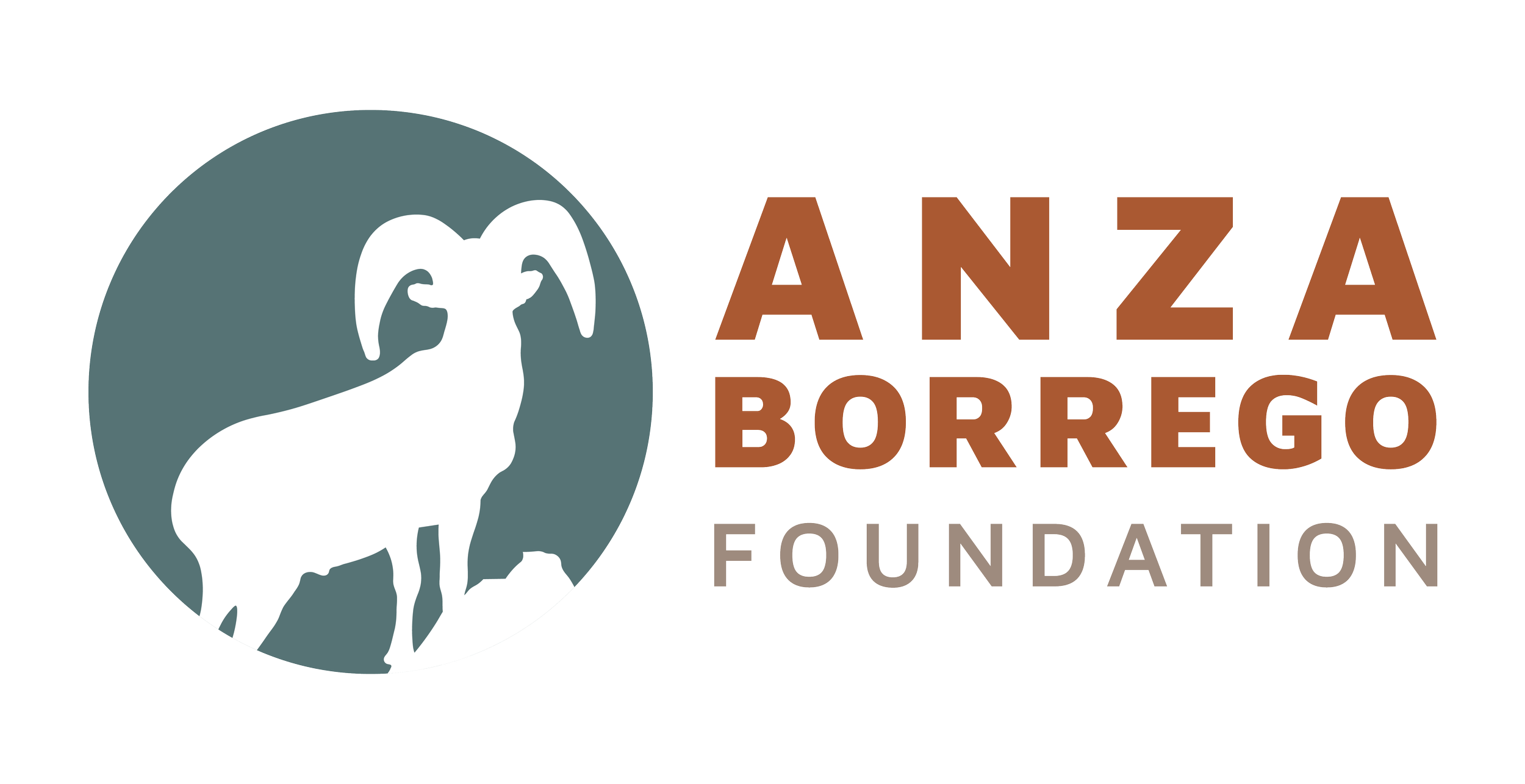
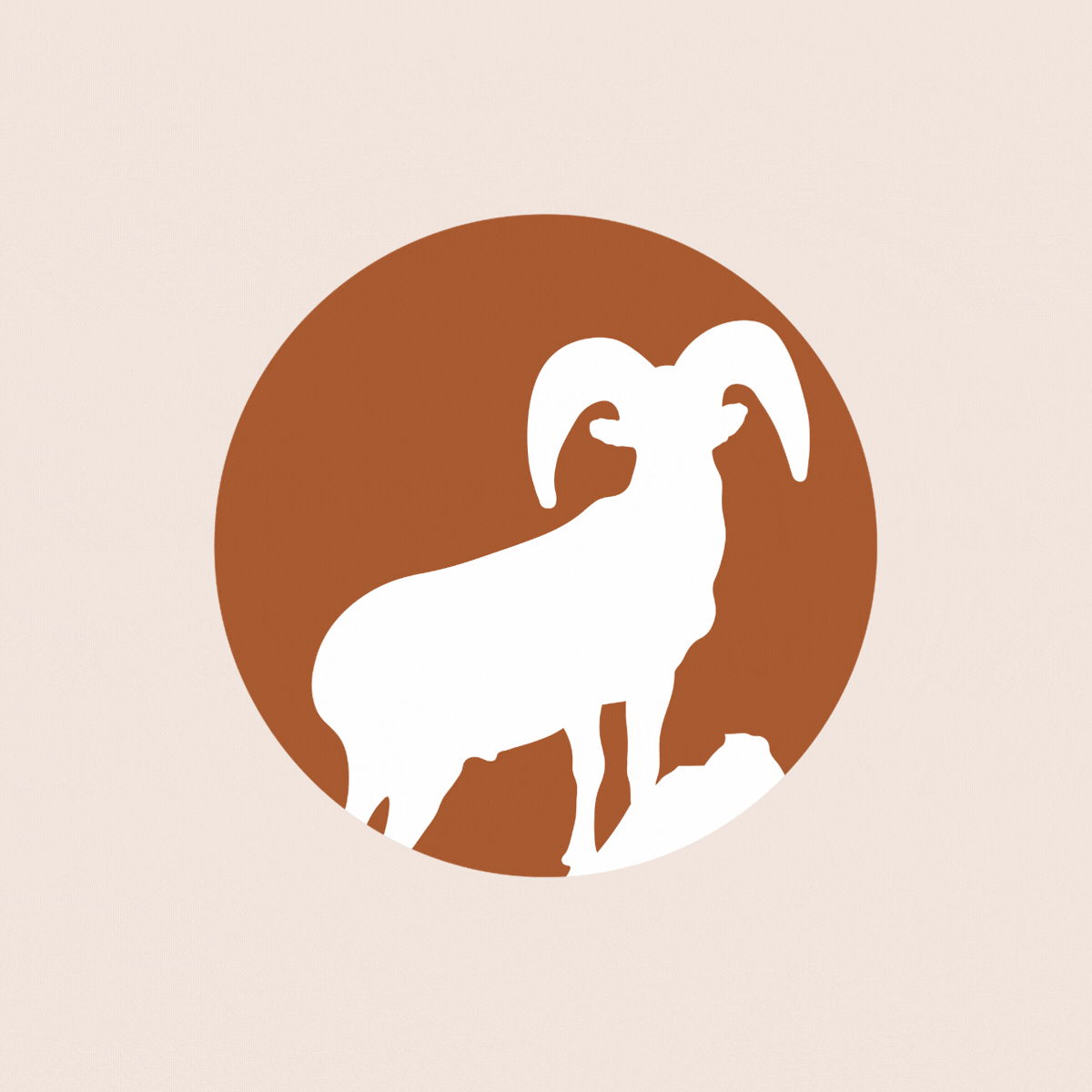
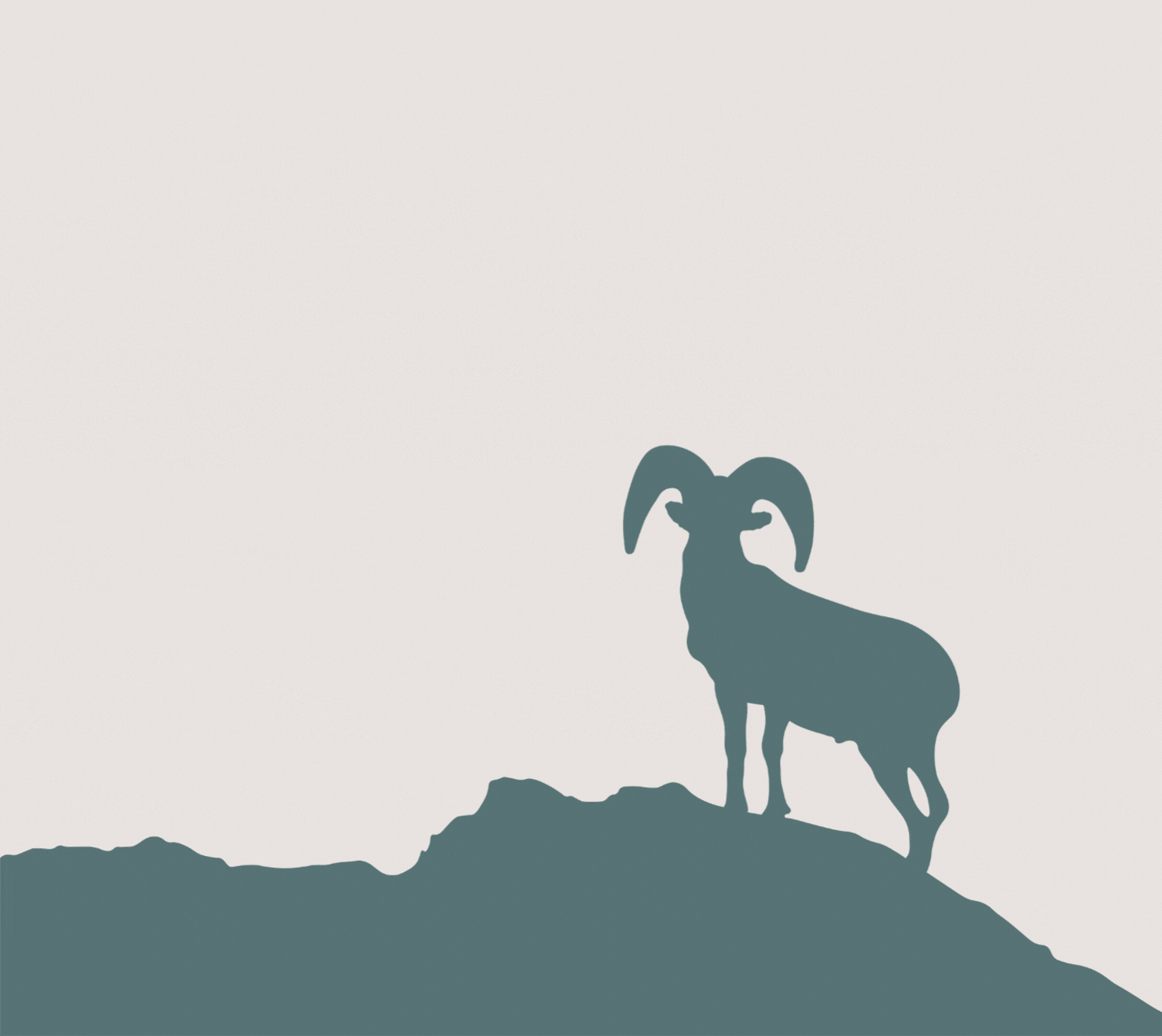
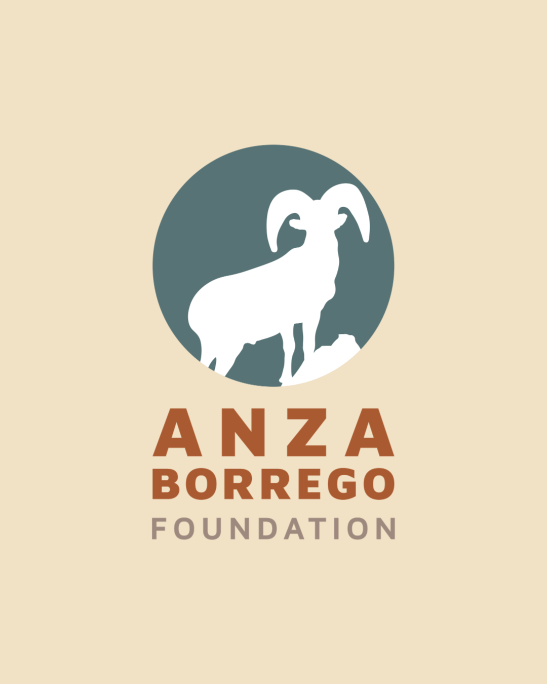
THE DESIGNAt the center of the brand is a simplified bighorn sheep mark, an iconic symbol of the region. The silhouette is bold and recognizable, allowing it to scale seamlessly across everything from small applications to large-format signage.
The typography is clean, strong, and highly legible, reinforcing clarity and accessibility while maintaining a modern, grounded feel.
The color palette reflects the desert landscape, muted greens, warm earth tones, and soft neutrals, creating a sense of place while remaining versatile across print and digital use.
Supporting elements extend the identity into a cohesive system. Landscape-inspired shapes and repeating patterns add depth and flexibility, while still maintaining a clean and structured visual language.
From business cards and brochures to signage and environmental graphics, the brand was designed to feel consistent, functional, and impactful in real-world settings.
The visual identity draws directly from the natural environment of Anza Borrego Desert.
THE RESULTSA refreshed identity that feels both modern and trustworthy
The new brand balances approachability with credibility, helping the foundation connect with a broader audience while maintaining its established reputation.
A cohesive system across all touch points
From printed materials to large-scale signage, the identity translates seamlessly across applications, creating a consistent and recognizable presence.
A brand rooted in place and purpose
By drawing directly from the landscape and wildlife of Anza-Borrego, the identity reinforces the foundation’s mission and strengthens its connection to the park.

Ready to build something intentional?
If you’re looking for clarity, confidence, and a marketing partner who thinks strategically and works thoughtfully, I’d love to connect.