
Northwoods Home Improvement
Northwoods Home Improvement is a locally owned service provider based in Old Forge, New York, offering plumbing, heating, septic, mechanical contracting, and seasonal services like winterizing for cabins and lake homes.
Built to serve both homeowners and businesses in the Adirondacks, the company was founded on a simple idea: provide reliable, high-quality work.
With a focus on responsiveness, transparency, and long-term relationships, Northwoods Home Improvement delivers dependable solutions tailored to the unique needs of the region.
Northwoods Home Improvement
Brand Strategy & Identity
The Brief
Northwoods Home Improvement was created to fill a gap in the local market: offering a more reliable, responsive, and accessible alternative to larger, less flexible service providers.
The goal was to establish a brand that felt trustworthy, capable, and grounded in the community, while clearly communicating the breadth of services offered. The brand needed to appeal to both year-round residents and seasonal homeowners, positioning the business as a go-to partner for ongoing maintenance, repairs, and property care.

THE CHALLENGEA market dominated by larger, less personal service providers
In the Old Forge and surrounding Adirondack region, many homeowners rely on a small number of well-known companies that often operate with long wait times, inconsistent communication, and higher costs.
The need to build trust quickly as a newer business
As a newer company, Northwoods Home Improvement needed to establish credibility and reliability from the start. The brand had to communicate experience, capability, and professionalism while still feeling approachable and local.
A wide range of services that needed clear positioning
Offering plumbing, heating, septic, mechanical work, and seasonal services created an opportunity, but also a challenge. The brand needed to communicate versatility without feeling scattered, ensuring potential clients understood both the scope and reliability of the work.

THE STRATEGYThe foundation of the brand began with a clear positioning: a reliable, local partner offering high-quality service without the friction often associated with larger providers.
Rather than competing on volume or scale, Northwoods Home Improvement was positioned around responsiveness, trust, and practicality. The strategy emphasized clear communication, fair pricing, and dependable service—aligning with what homeowners in the area actually value.
We focused on simplifying how the business presents its services, grouping offerings in a way that feels cohesive and easy to understand. Messaging was grounded, direct, and straightforward, avoiding industry jargon while still reinforcing expertise.
The brand was built to resonate with both full-time residents and seasonal homeowners, particularly those who need a trusted partner to maintain and protect their properties year-round.
This strategic direction created a foundation that supports both immediate visibility and long-term growth within the local community.

THE DESIGNVisually, the brand needed to feel grounded, capable, and built for real-world application, not overly polished, but not rough or unrefined either.
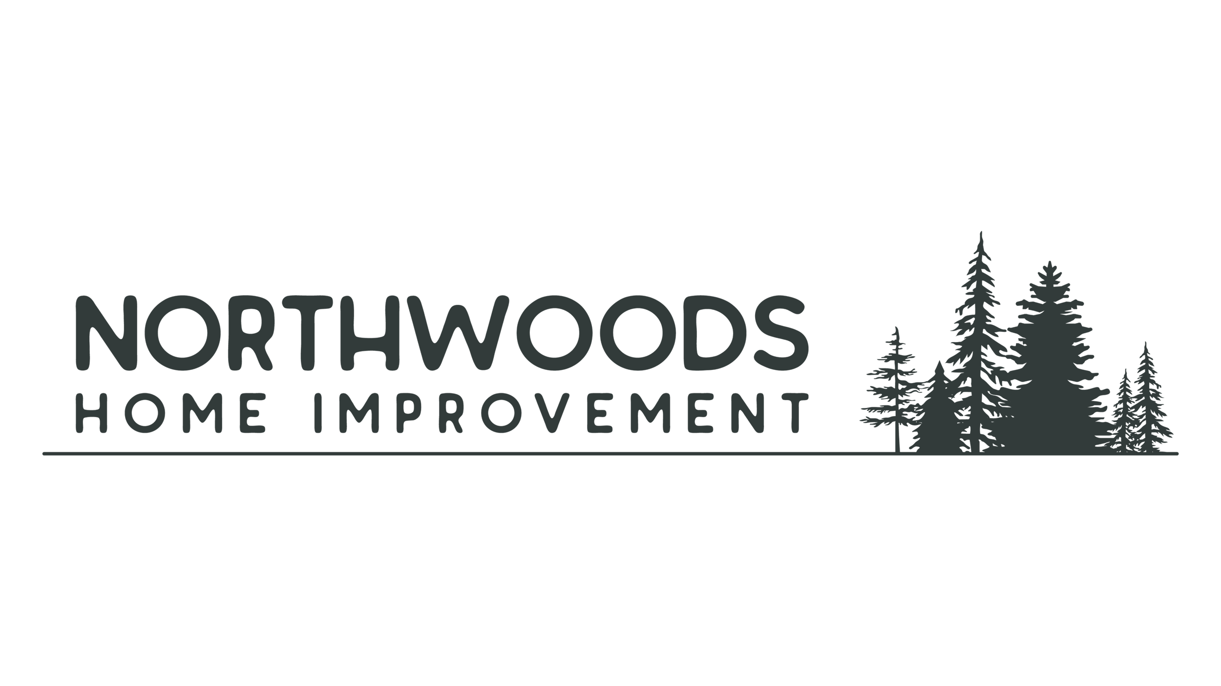
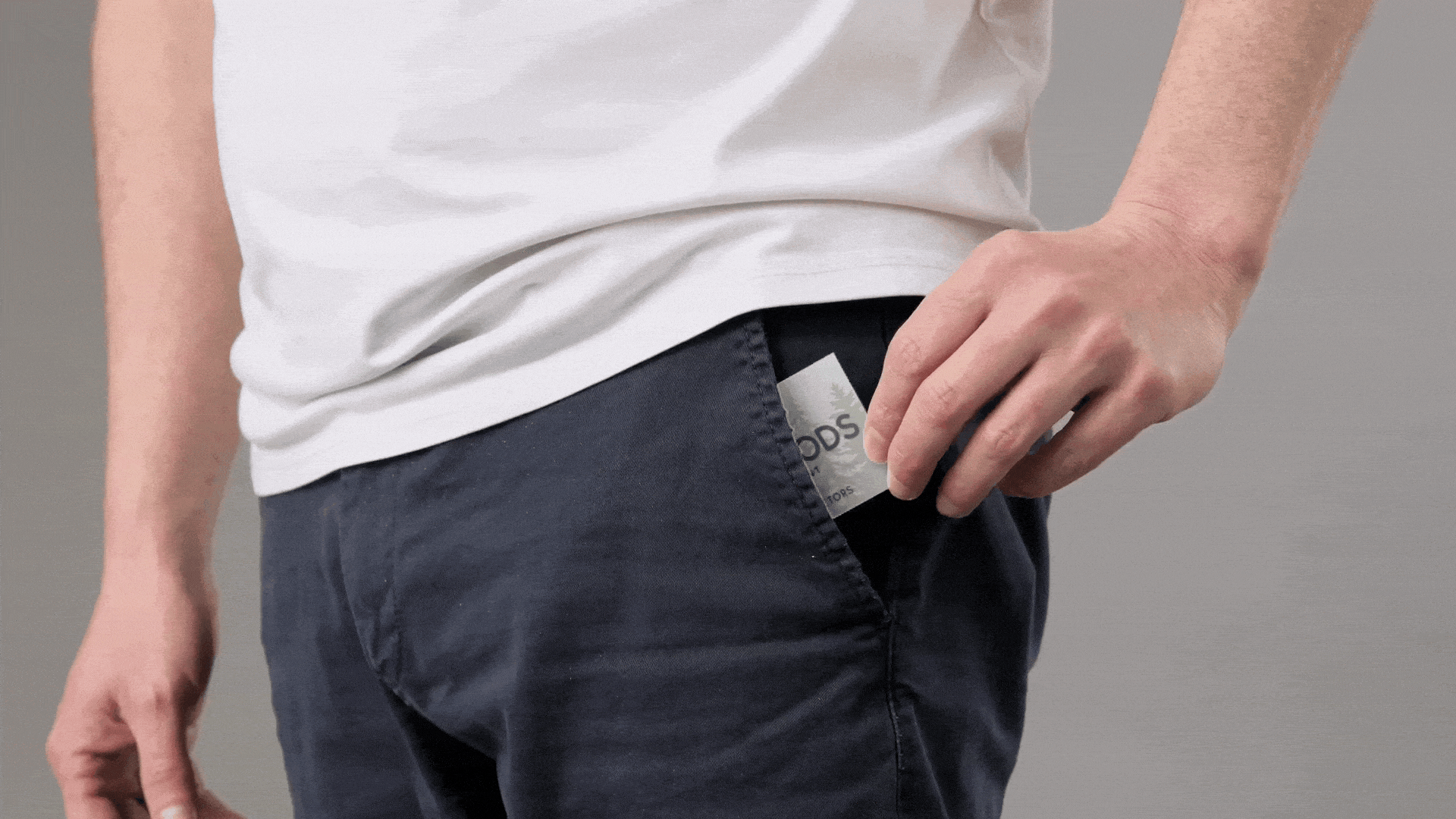
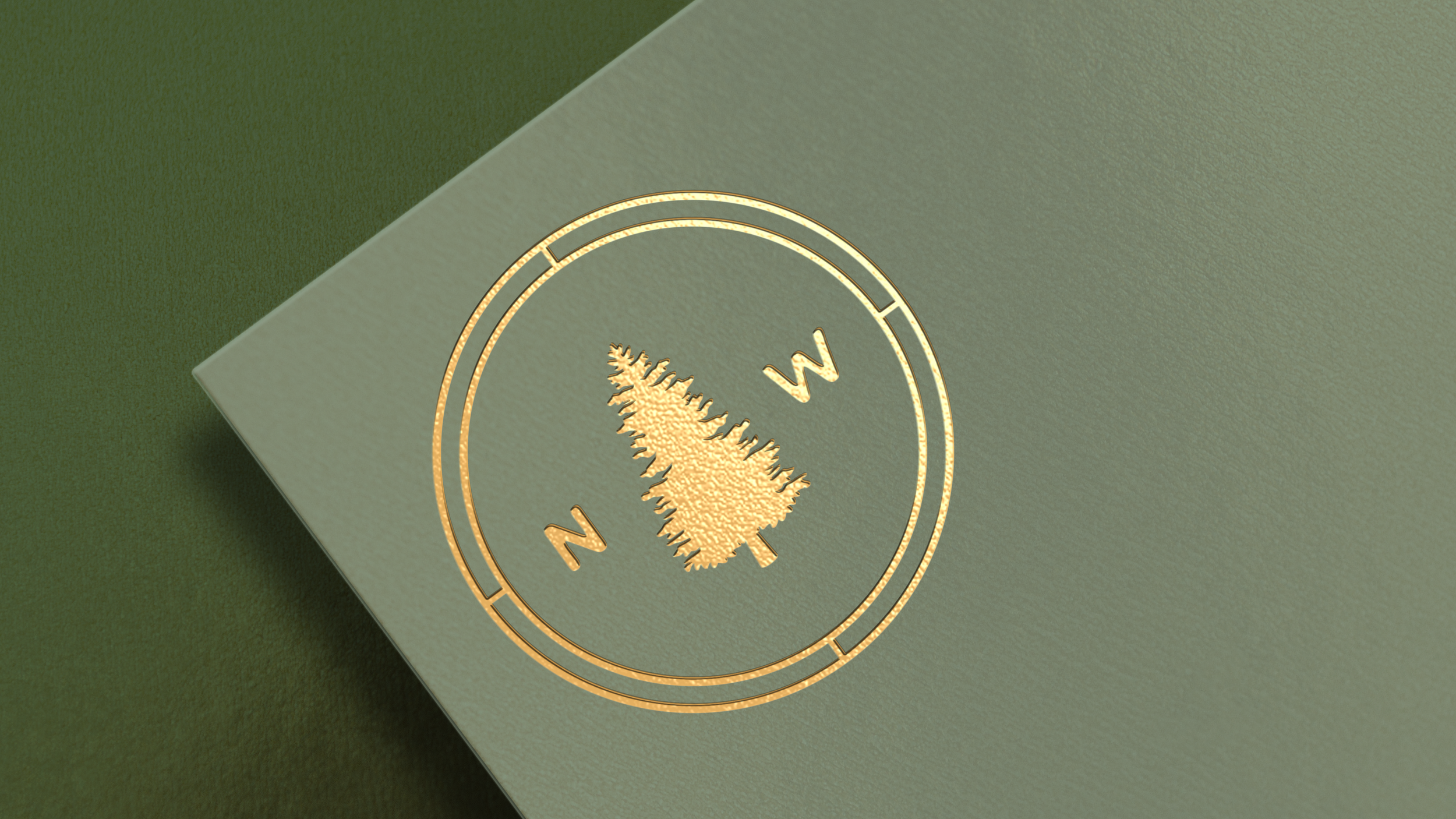
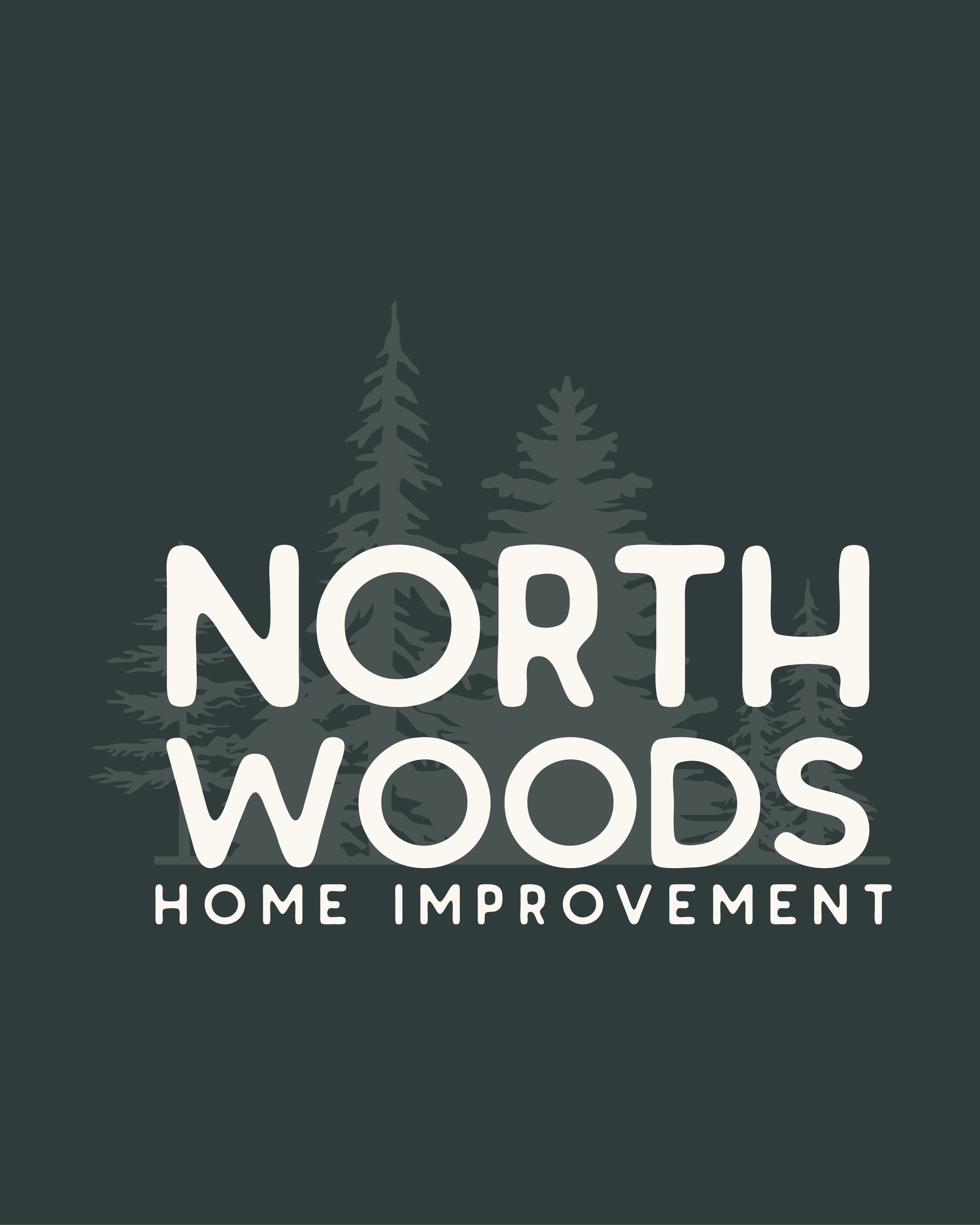
We developed a flexible identity system that balances strength with approachability. The primary wordmark is bold and highly legible, designed to hold its own across trucks, uniforms, and equipment. Subtle variations, including tree-inspired letterforms and a custom “NW” mark, introduce a sense of place, tying the brand back to the Adirondack landscape without relying on overly literal or rustic design tropes.
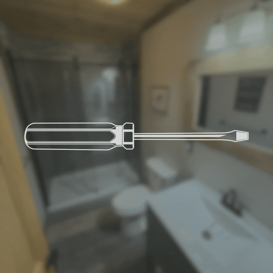
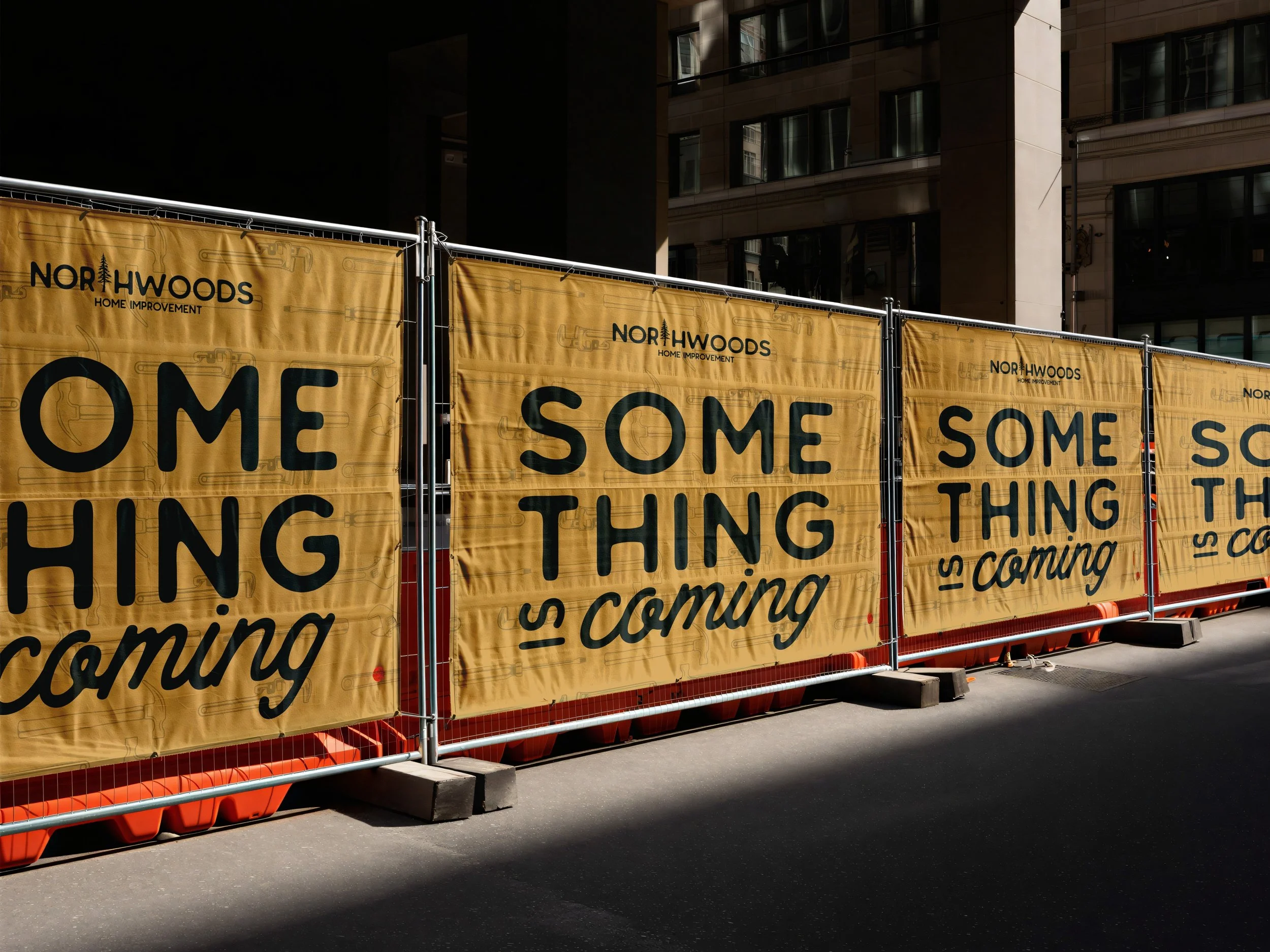
Supporting graphics expand the identity into a full system. A custom pattern built from tools and mechanical elements reinforces the hands-on nature of the work, while remaining clean and structured rather than chaotic. Iconography and linework are intentionally simple, allowing the brand to feel organized, practical, and easy to recognize at a glance.
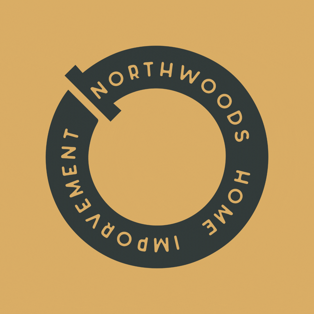
Additional marks, including badge-style logos and circular emblems, were designed for versatility working seamlessly across decals, apparel, and stamped materials. These elements give the brand flexibility while maintaining consistency across every touchpoint.
The overall color direction stays neutral and grounded, allowing form, typography, and structure to lead. This ensures the brand feels durable and timeless, rather than trendy or overly styled.
The result is a visual identity that feels dependable and adaptable built to function in the field while still presenting a clear, cohesive, and professional brand.
THE RESULTSA brand that builds trust from the first interaction
Northwoods Home Improvement now presents as a reliable, professional service provider helping establish credibility quickly in a competitive local market.
Clear positioning that differentiates from larger competitors
By emphasizing responsiveness, transparency, and local connection, the brand stands apart from larger, less personal providers in the area.
A cohesive foundation for long-term growth
With clear messaging and a flexible visual system, the business is positioned to grow through repeat clients, referrals, and ongoing service relationships.

Ready to build something intentional?
If you’re looking for clarity, confidence, and a marketing partner who thinks strategically and works thoughtfully, I’d love to connect.