
Sugar & Honey
Sugar & Honey is a children’s boutique offering thoughtfully curated pieces for babies, toddlers, and youth.
Blending sweetness with sophistication, the brand is designed for modern parents who value quality, style, and attention to detail. From everyday essentials to special pieces, Sugar & Honey creates a shopping experience that feels elevated, intentional, and effortlessly charming.
Sugar & Honey
Brand Strategy & Identity
The Brief
Sugar & Honey needed a brand identity that would stand out in the children’s retail space—one that felt playful and approachable, while still refined and elevated.
The goal was to move away from overly juvenile or cartoon-like aesthetics and instead create a brand that appealed to both children and parents. The identity needed to feel warm, stylish, and memorable, while remaining versatile across packaging, tags, and digital platforms.
THE CHALLENGEBreaking away from overly childish design in a saturated market
Children’s boutiques often rely on bright colors, cartoon graphics, and trend-driven visuals. Sugar & Honey needed a brand that felt more elevated—something that would resonate with style-conscious parents without losing its sense of warmth and playfulness.
Creating a brand that speaks to both parent and child
The identity needed to strike a balance: soft and inviting enough for a children’s brand, while refined enough to feel like a boutique, not a big-box retailer.
Building a flexible identity for both product and packaging
From clothing tags to digital presence, the brand needed to translate seamlessly across a variety of touch points to maintain consistency while allowing for creativity and growth.
THE STRATEGYThe transformation began with a clear insight: this brand wasn’t just for children, it was for the parents choosing what their children wear.
Rather than leaning into overly playful or trend-driven design, we positioned Sugar & Honey as a boutique brand that blends softness with sophistication. The strategy centered around creating a brand that feels timeless, elevated, and emotionally warm appealing to parents who value both style and quality.
We anchored the identity in contrast: sweet but refined, playful but composed, expressive but intentional. This balance allowed the brand to stand apart from competitors while still feeling approachable and relevant.
Messaging and visual direction were designed to feel calm, confident, and curated, reinforcing the idea that Sugar & Honey offers more than products; it offers a thoughtfully designed experience.
The result is a brand that speaks to modern families looking for something more elevated than the typical children’s retail experience.
THE DESIGNVisually, the brand was designed to feel soft, elevated, and quietly playful.
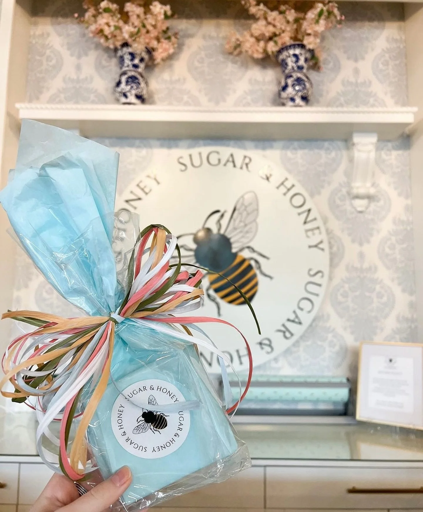
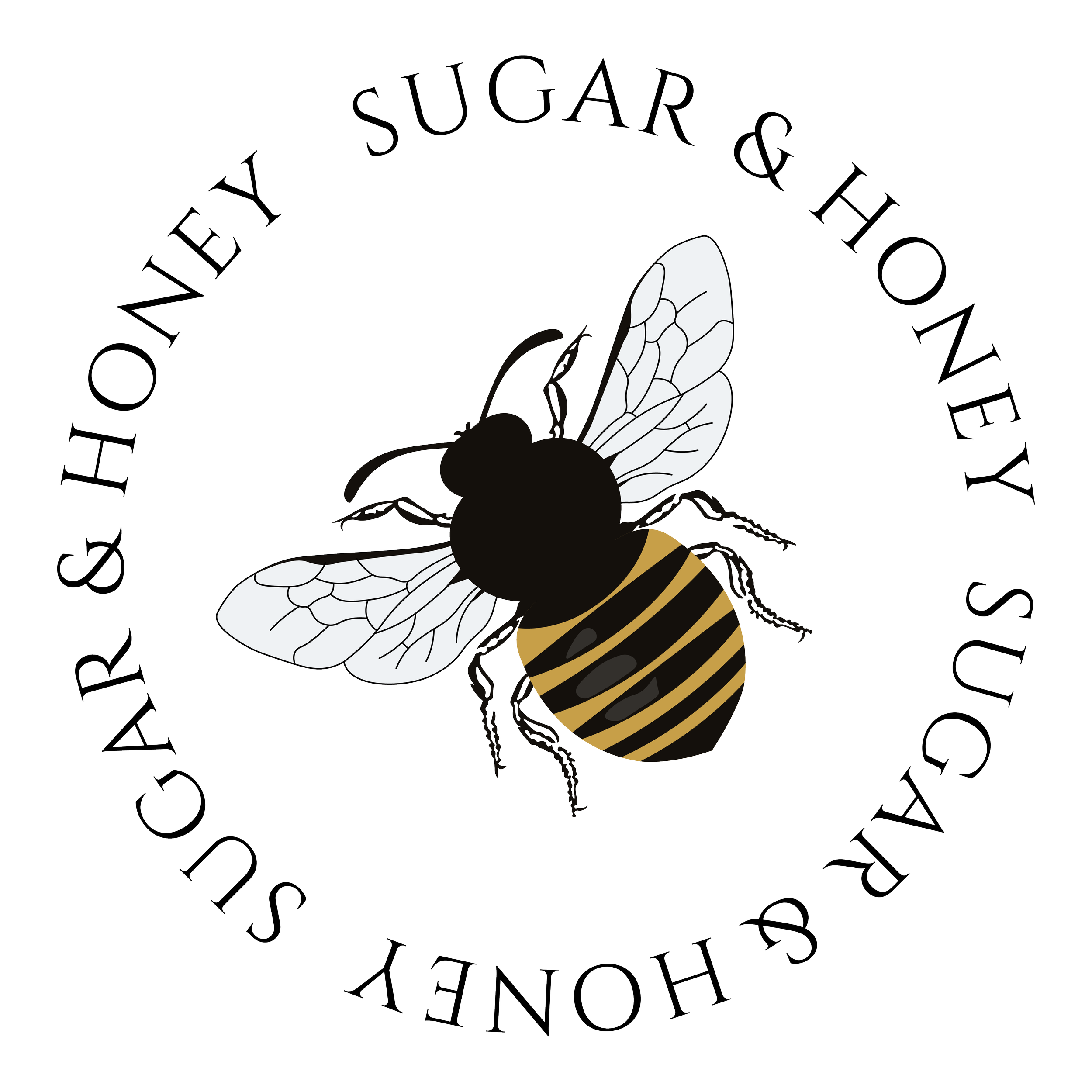
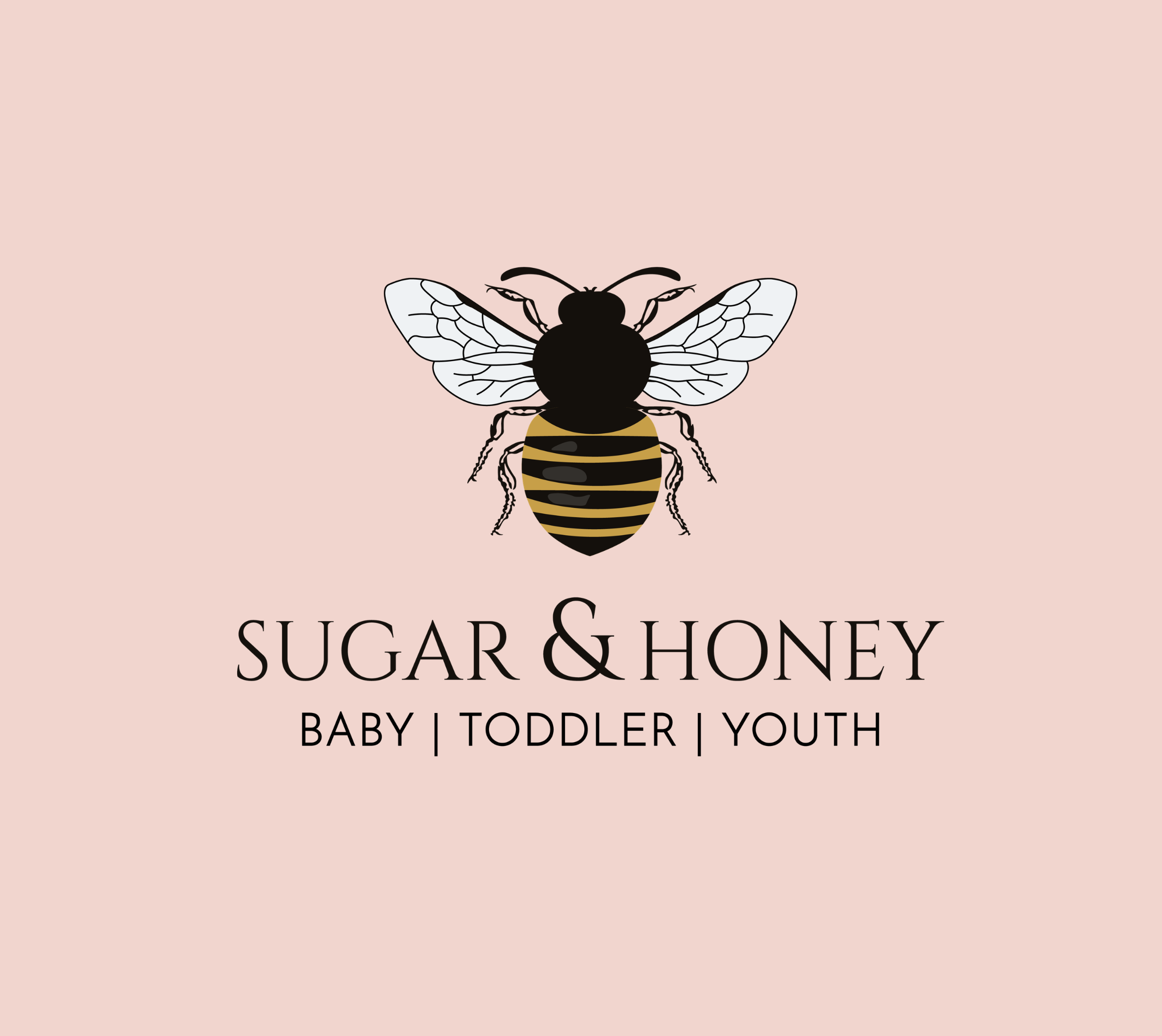
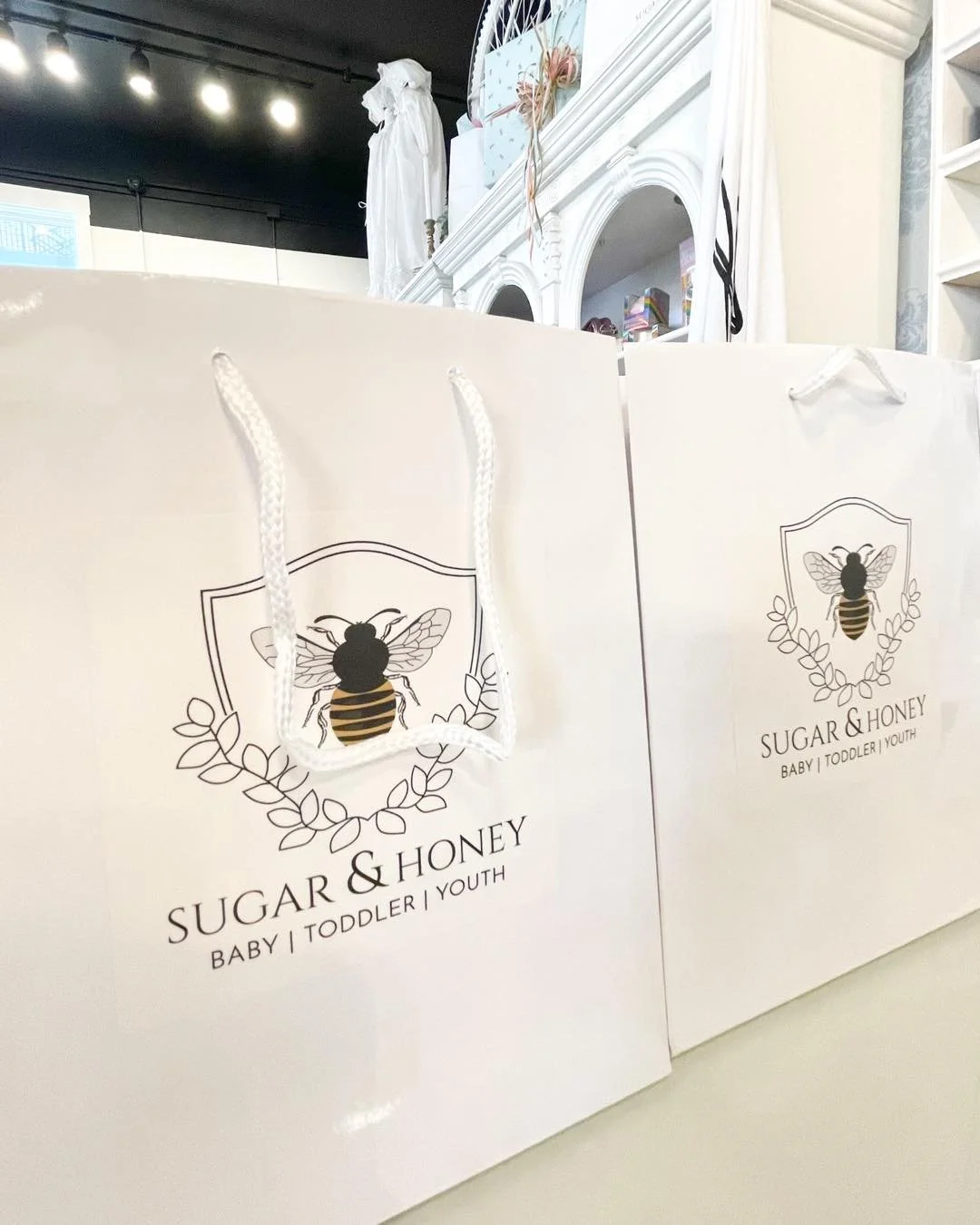
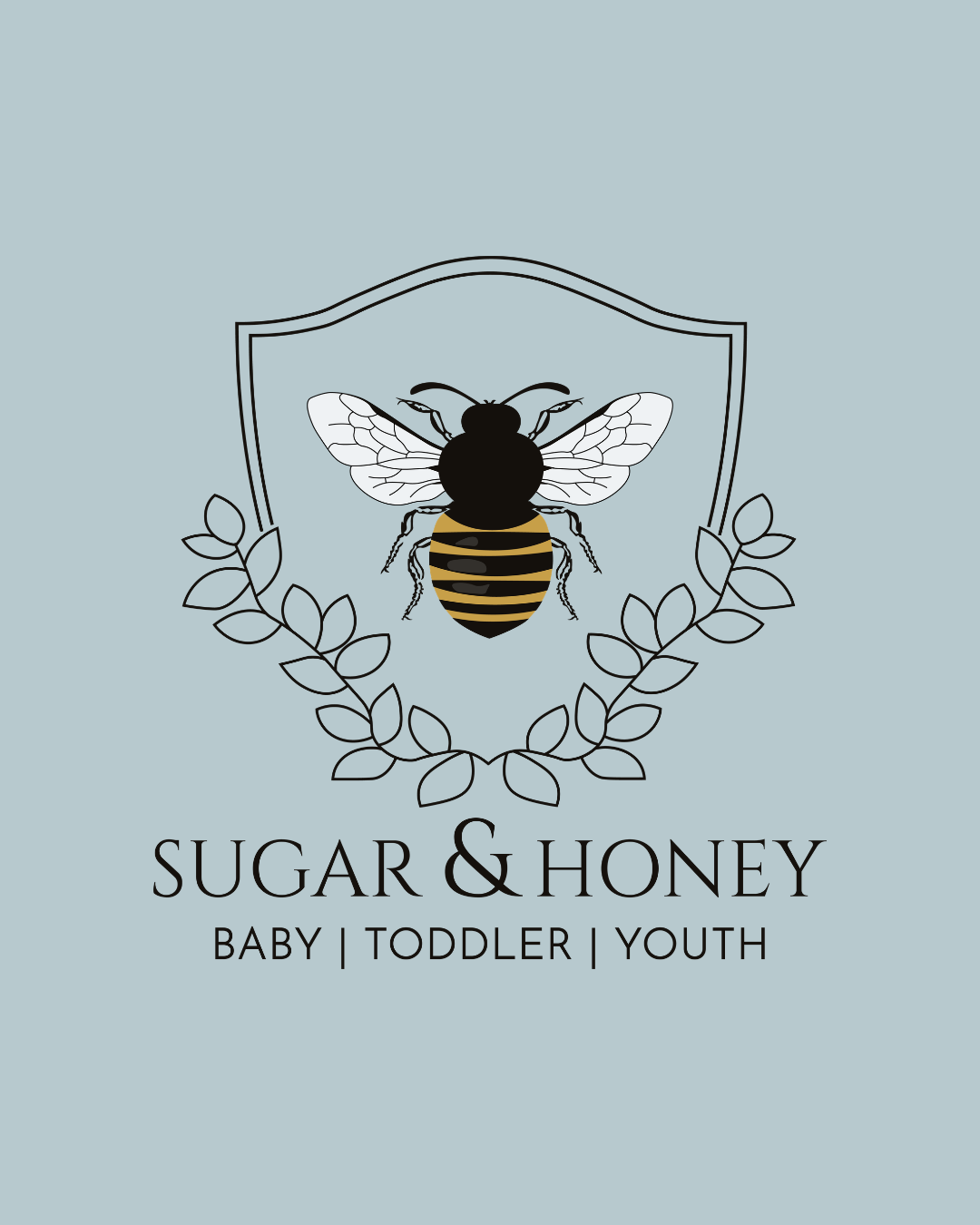
At the center of the identity is a detailed bee mark, a symbol that captures both the “honey” aspect of the brand and a sense of craftsmanship and care. The illustration is refined and intentional, avoiding anything overly cartoon-like while still feeling approachable and on-theme.
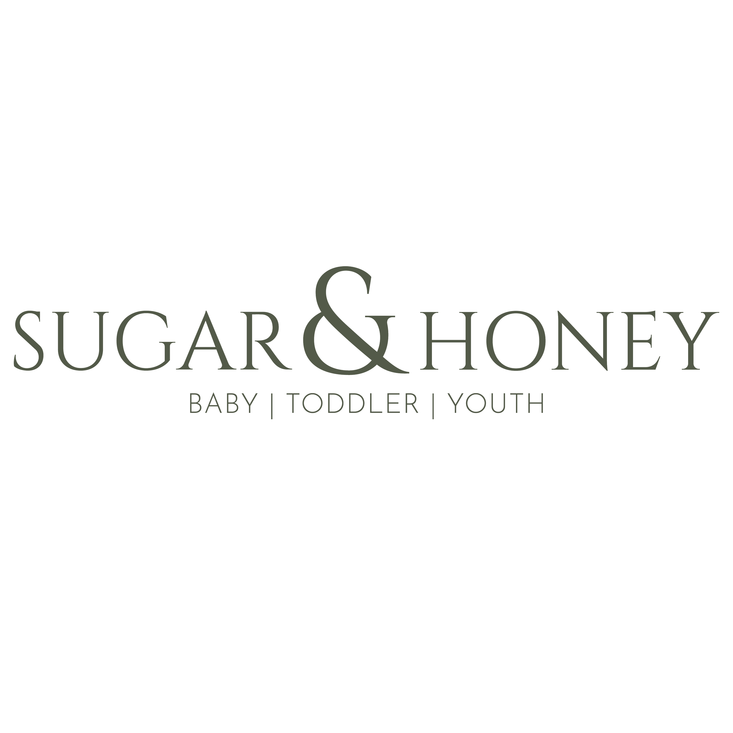
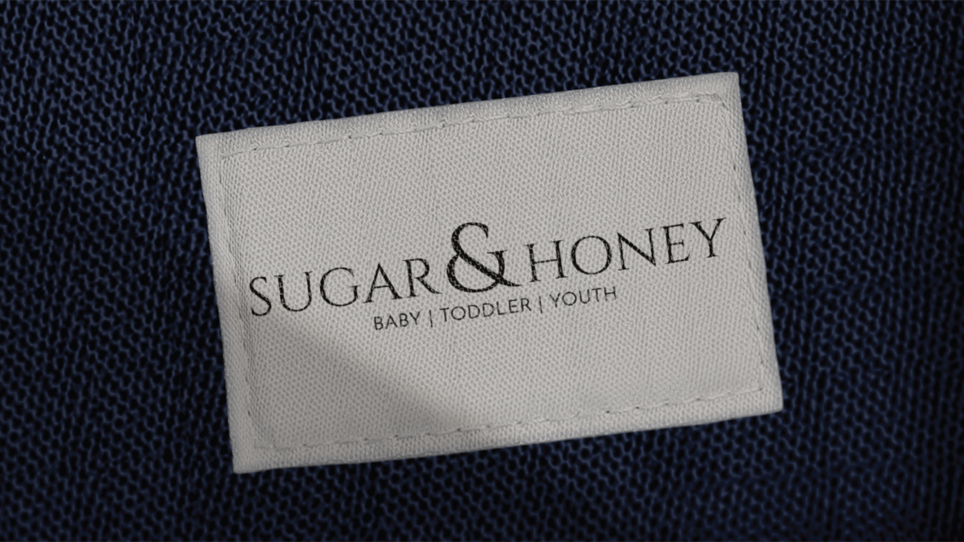
Typography plays a key role in balancing the brand. Elegant serif lettering introduces a sense of sophistication, while the layout and spacing keep the overall feel light and modern. The result is a wordmark that feels boutique-driven rather than mass-market.
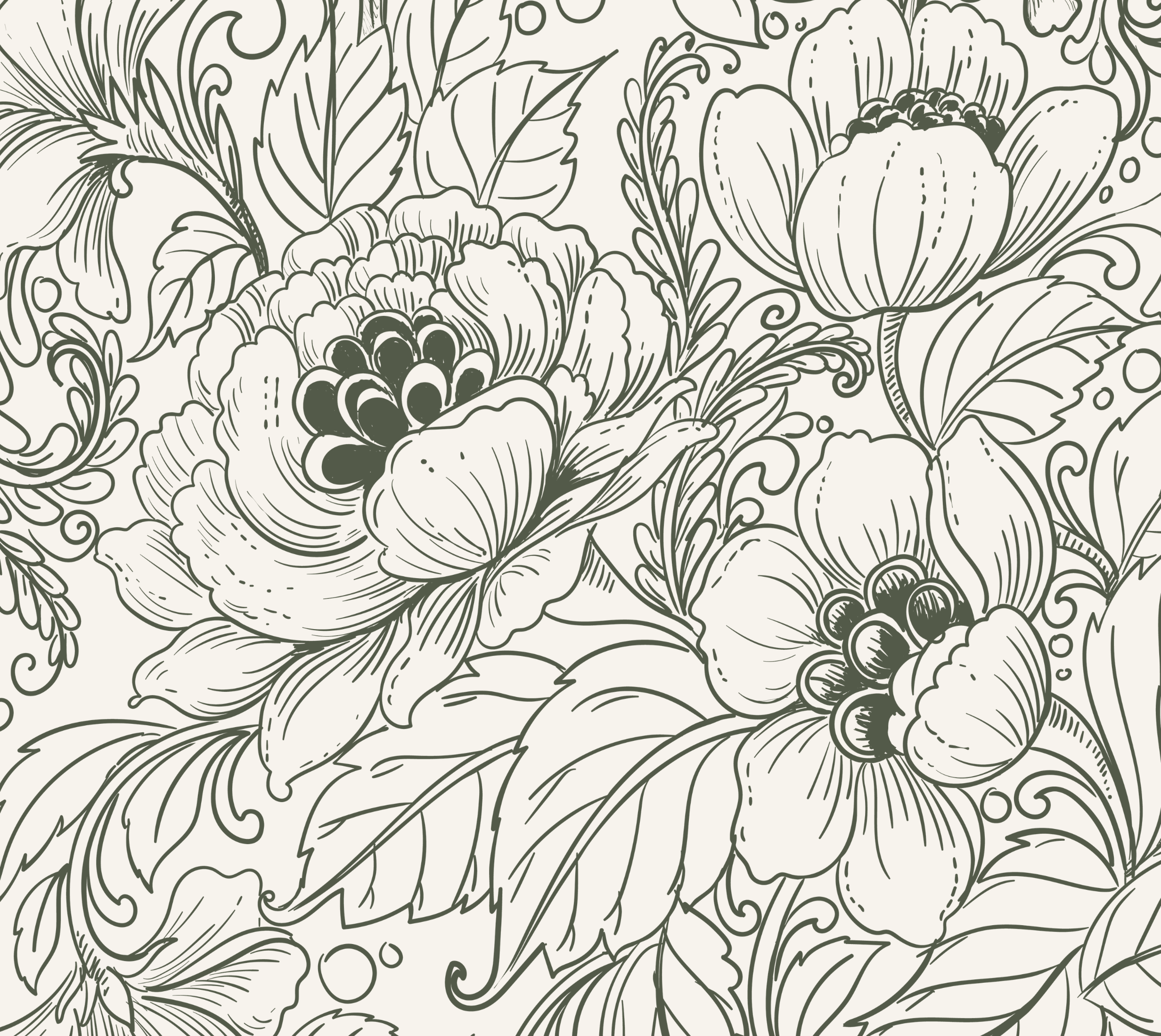
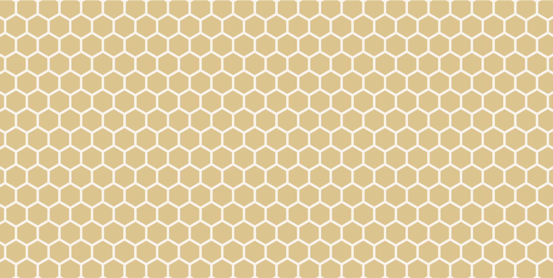
Supporting elements expand the identity into a full system. A honeycomb pattern introduces structure and repetition, while soft floral linework adds a layer of femininity and texture. These elements create visual interest while maintaining a cohesive and recognizable aesthetic.
The color palette leans warm and natural, honey tones, soft neutrals, and muted greens, reinforcing the brand’s warmth while keeping it grounded and versatile.
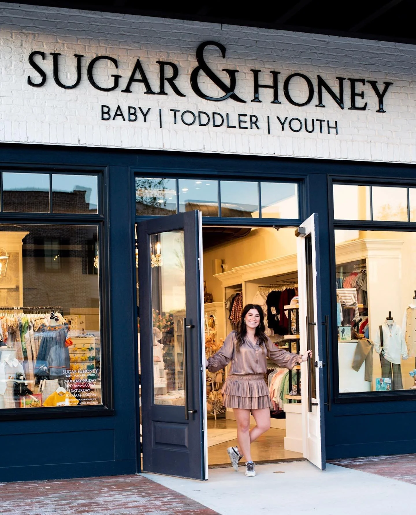
From product tags to packaging and digital applications, the identity was designed to feel consistent, intentional, and elevated at every touchpoint.
The result is a brand that feels distinctive and memorable blending sweetness with sophistication in a way that resonates with both parents and children.
THE RESULTSA children’s brand that feels elevated and distinctive
Sugar & Honey stands out in a crowded market by offering a refined alternative to traditional children’s branding appealing to modern, style-conscious parents.
A cohesive identity across every touchpoint
From product tags to patterns and packaging, every element works together to create a consistent and recognizable brand experience.
A brand built for growth and flexibility
With a strong visual system and clear positioning, Sugar & Honey is equipped to expand its offerings while maintaining a cohesive and elevated identity.

Ready to build something intentional?
If you’re looking for clarity, confidence, and a marketing partner who thinks strategically and works thoughtfully, I’d love to connect.