
The Retirement Studio
The Retirement Studio is a modern retirement planning and wealth management firm built on clarity and simplicity. Focused on removing unnecessary complexity, the studio helps businesses and individuals navigate financial decisions with transparency and confidence.
Its mission is simple: make retirement planning feel approachable, personal, and empowering, not overwhelming.


The Retirement Studio
Brand Strategy & Identity · Ongoing Marketing
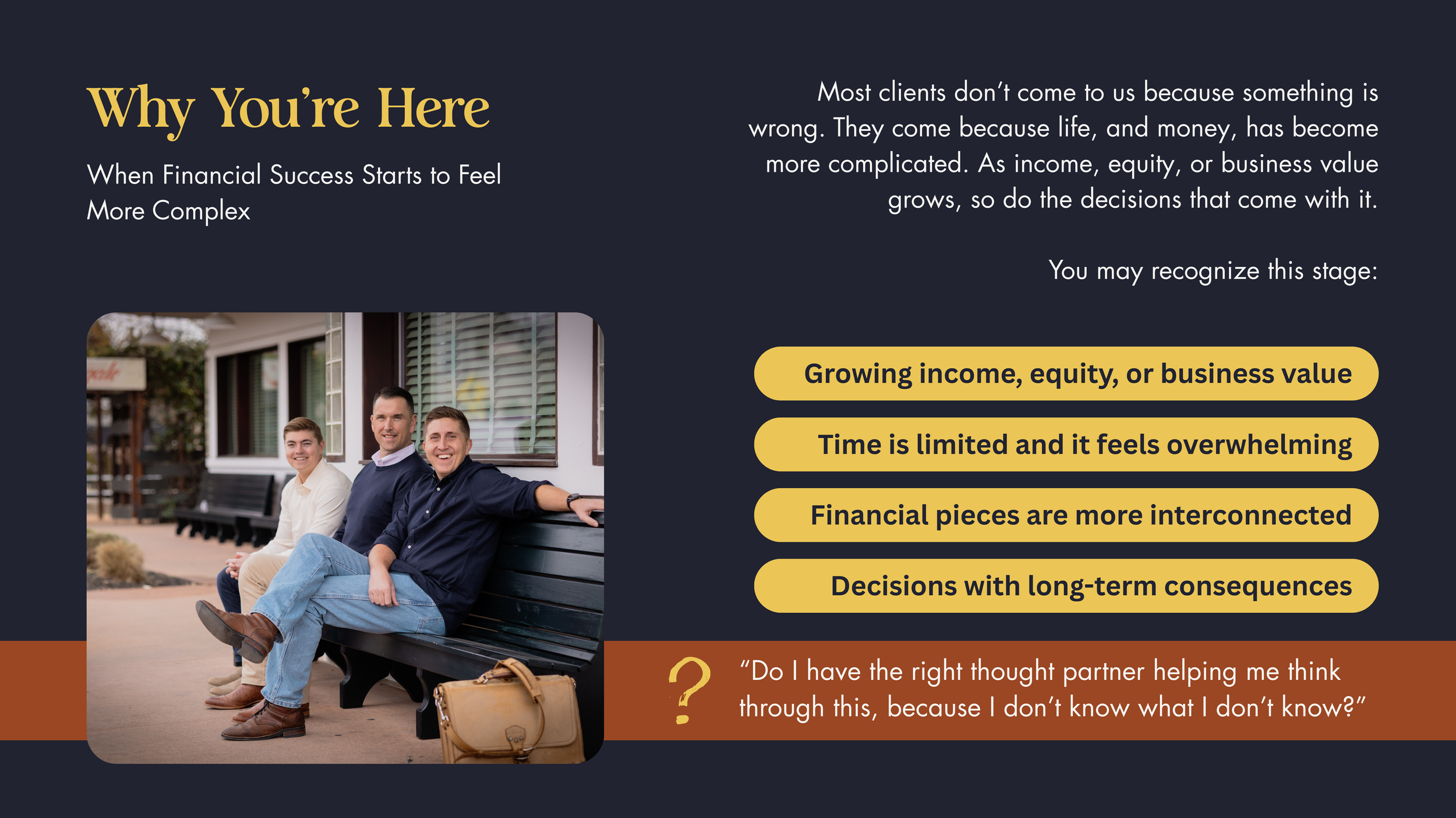
The Brief
The Retirement Studio was preparing to launch with a need for a brand identity that would distinguish it from traditional financial firms. In an industry often defined by corporate rigidity and complexity, the goal was to create a brand that felt both trustworthy and approachable.
The identity needed to balance professionalism with warmth, simplify the perception of retirement planning, and position the firm as modern, people-first, and clarity-driven.

THE CHALLENGEA financial brand that blended into a crowded market
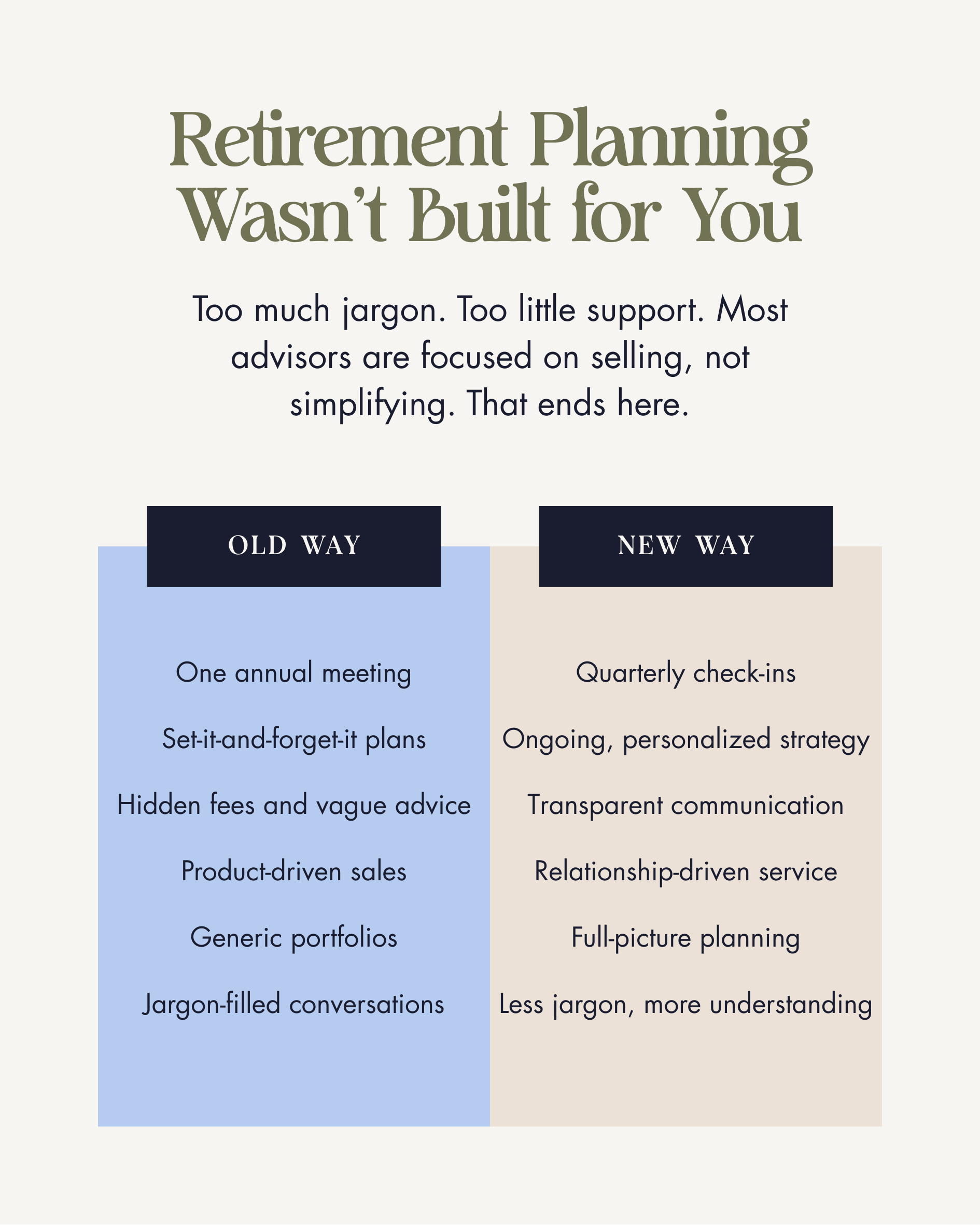
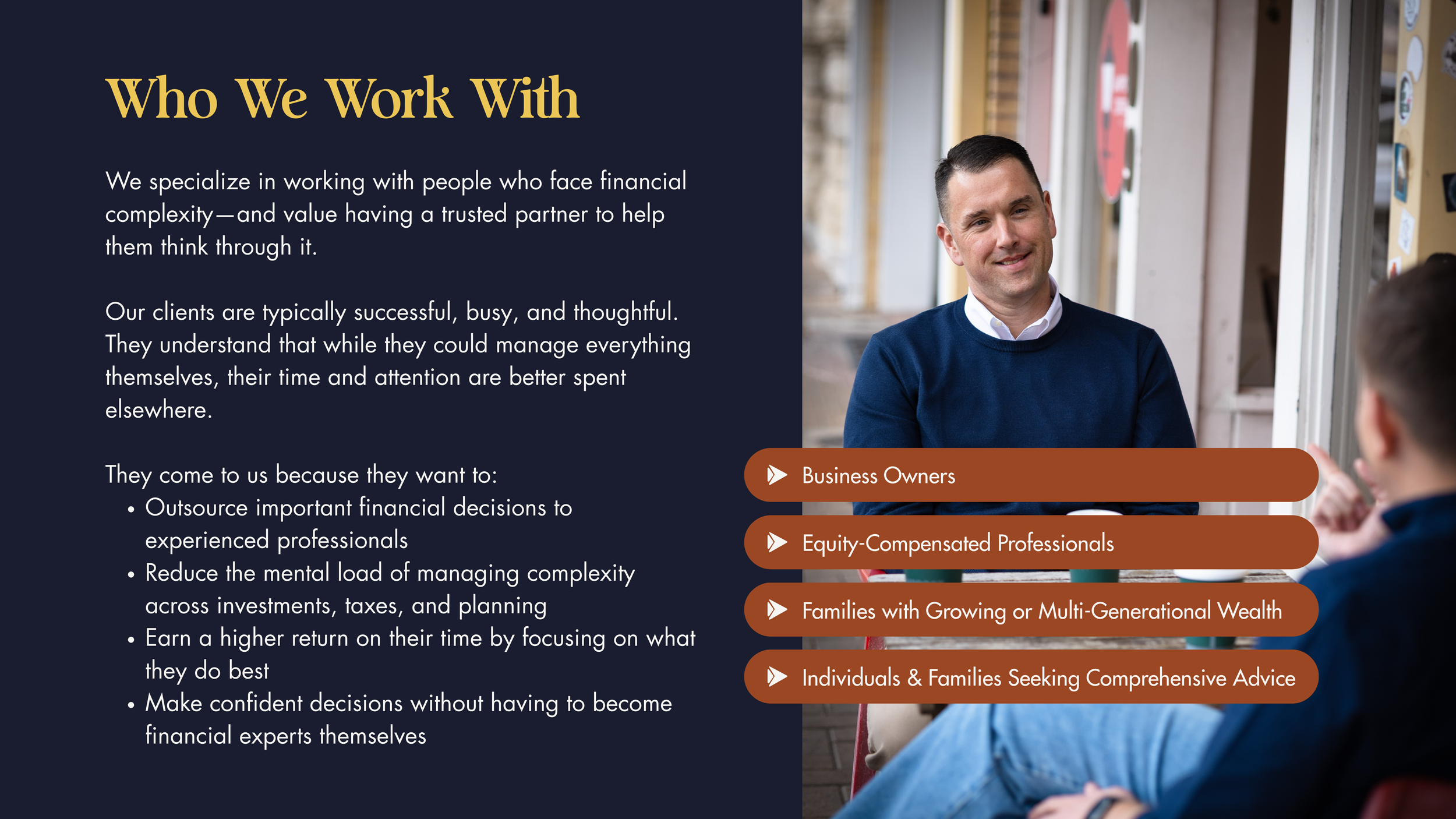
The Retirement Studio was entering an industry dominated by rigid, overly corporate firms. Most financial brands rely on formality, jargon, and traditional aesthetics, making it difficult for newer firms to stand out without sacrificing credibility.
The tension between trust and approachability
In wealth management, professionalism is non-negotiable. But so is connection. The challenge was creating a brand that felt trustworthy and established, while also modern, human, and easier to engage with. The brand needed to simplify retirement planning without appearing simplistic.
A need for clarity in both positioning and perception
Retirement planning is often perceived as complex and intimidating. The Retirement Studio needed an identity and message that reframed the experience making financial strategy feel clear, transparent, and people-first. The goal was to reflect simplicity and confidence while still communicating expertise and long-term stability.

THE STRATEGYThe transformation began with a clear insight: retirement planning doesn’t have to feel intimidating to be taken seriously.
In a space dominated by rigid, overly corporate firms, The Retirement Studio had an opportunity to do something different. Not by lowering the bar on professionalism, but by redefining what trust could look and feel like.
Through brand strategy work, we clarified the core mission: simplify retirement planning by removing unnecessary complexity and replacing it with clarity, transparency, and partnership. The brand wasn’t here to overwhelm clients with jargon or distance itself behind tradition. It was here to make financial strategy feel accessible, human, and empowering.
We repositioned The Retirement Studio as a boutique, forward-thinking firm; one that bridges heritage and innovation. The strategy balanced credibility with warmth, professionalism with personality, and long-term stability with modern connection.
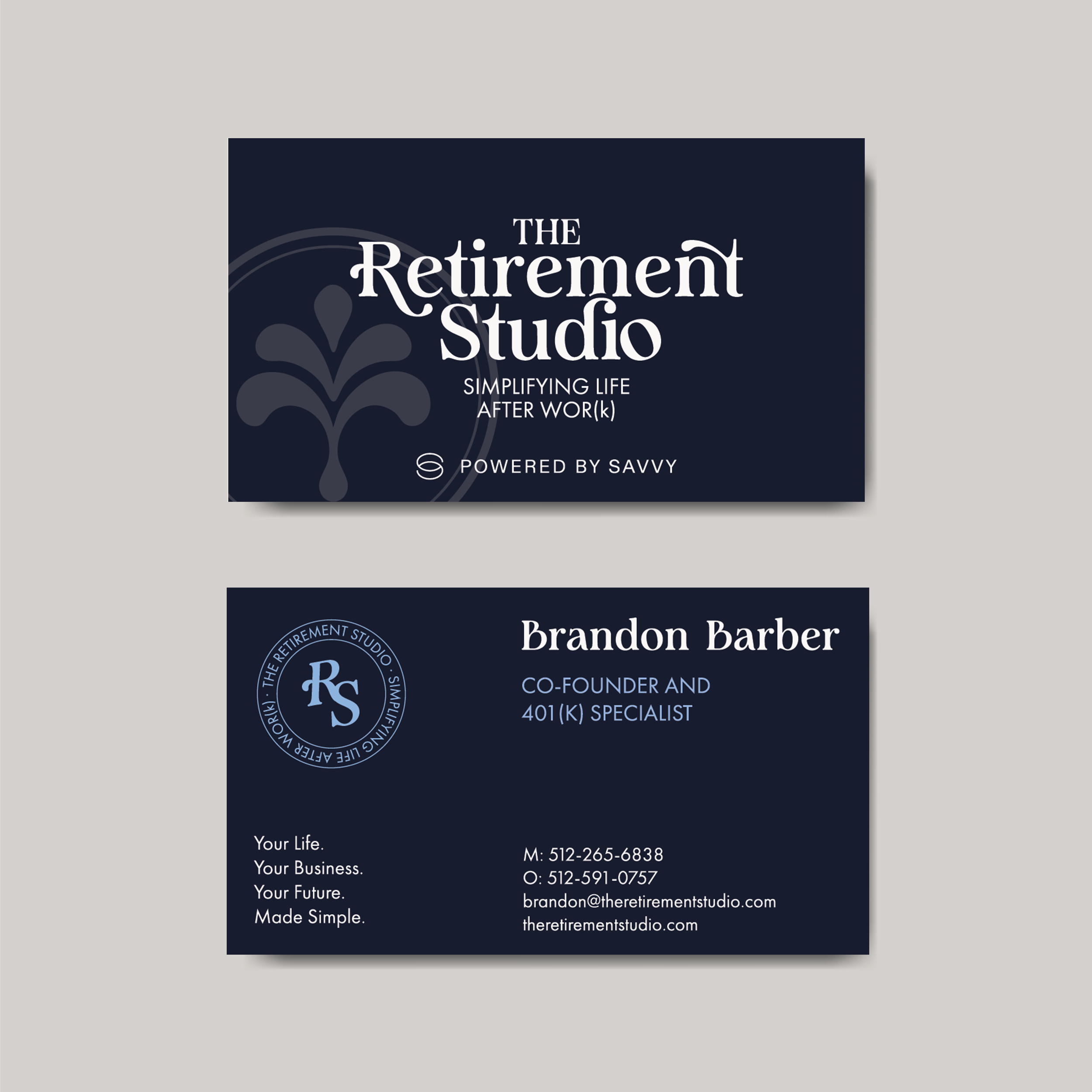
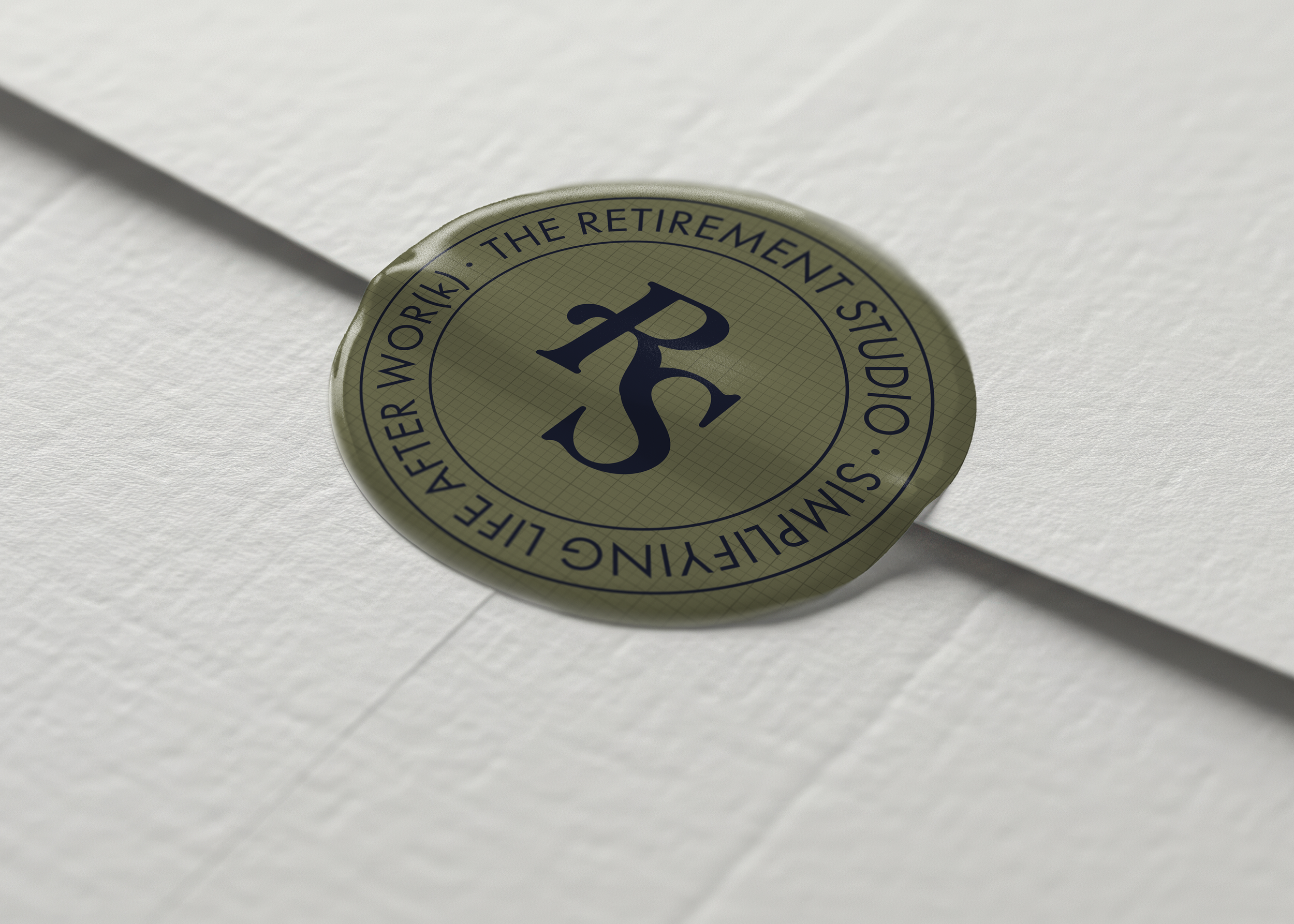
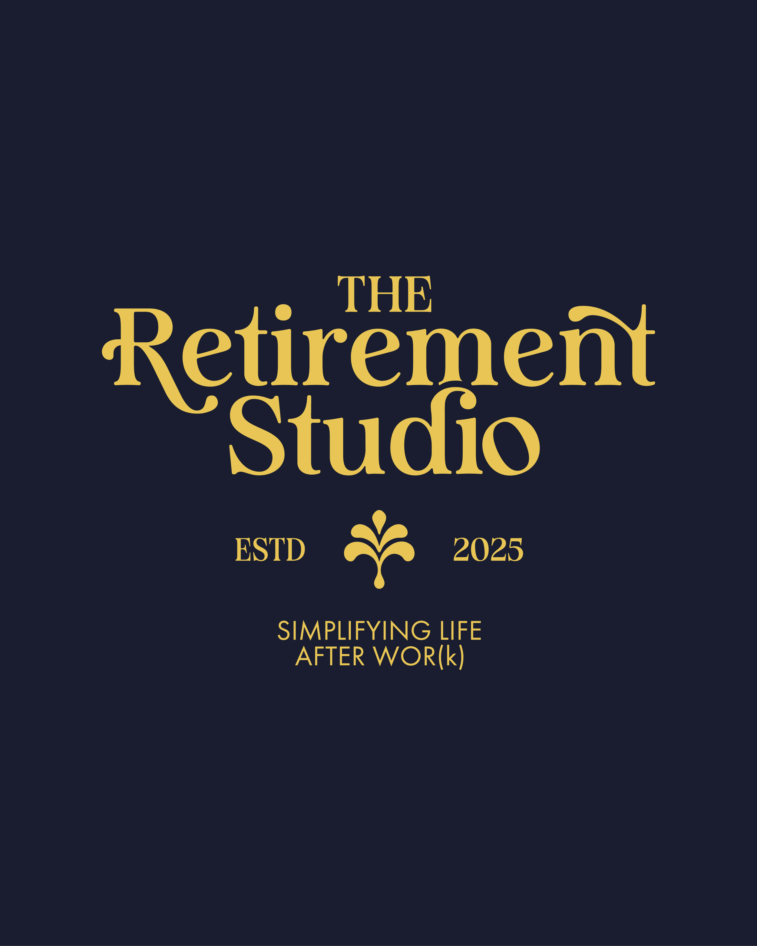
Messaging was restructured to emphasize simplicity and confidence. The tagline, Life After Wor(k), Made Simple, became the anchor, reinforcing both the emotional promise and the practical benefit of the service.
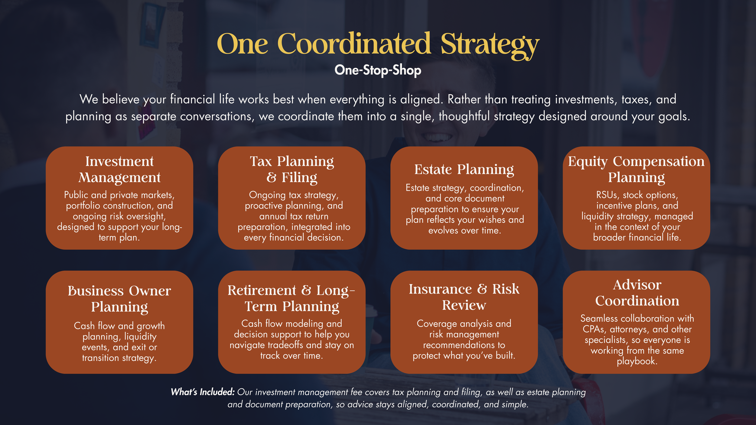
The strategy ensured that brand, voice, and visual identity would operate as one cohesive system, supporting not just a launch, but long-term growth.

THE DESIGNVisually, the brand needed to balance tradition with approachability. It had to feel established and trustworthy, while also modern, distinctive, and human.
We crafted a visual identity rooted in contrast. A retro-inspired serif wordmark introduced warmth and personality while maintaining the gravitas expected in financial services. Subtle detailing within the typography softened the overall feel, signaling that this firm operates differently.
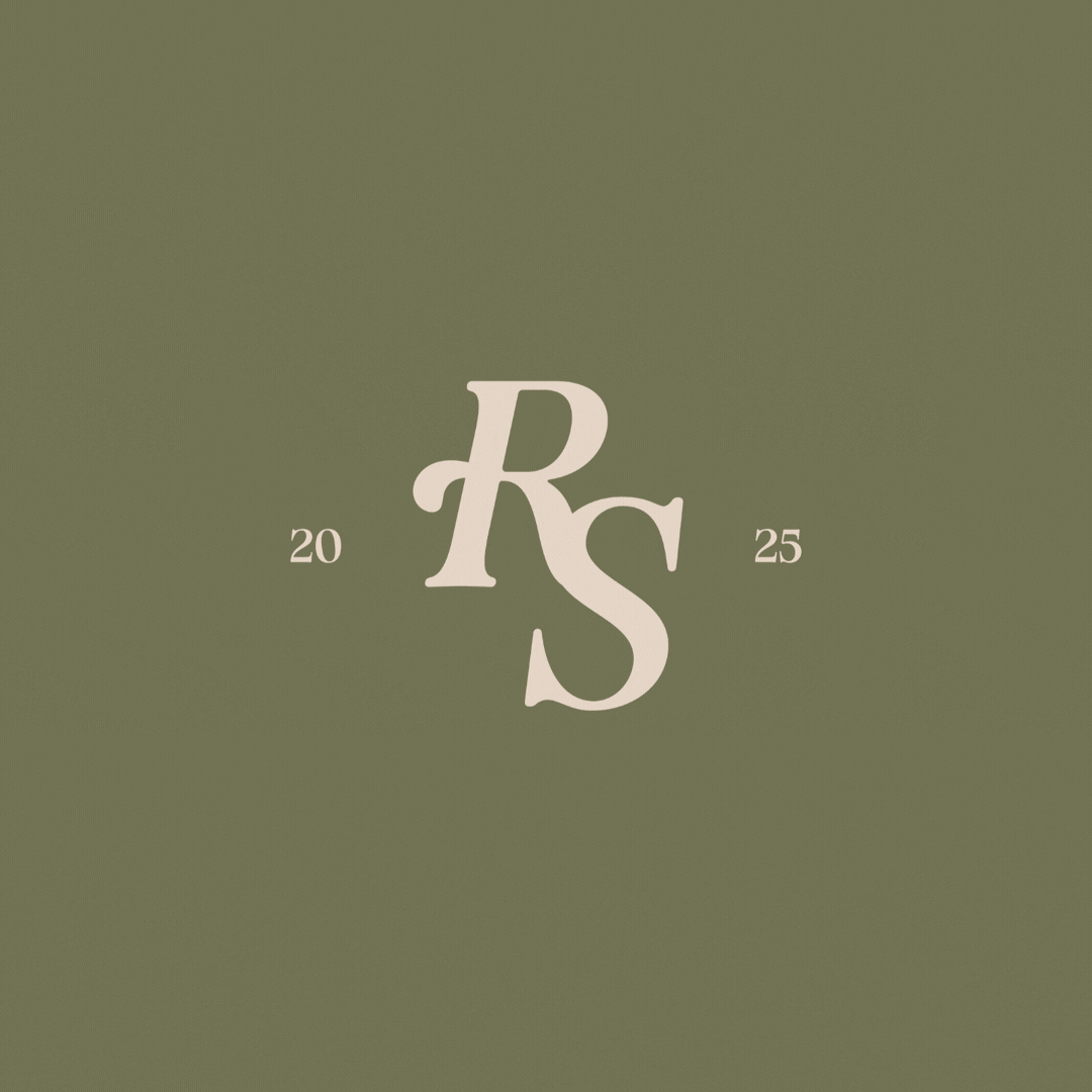
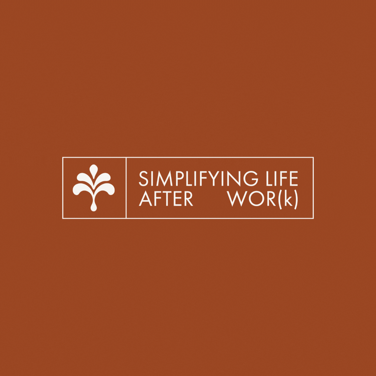
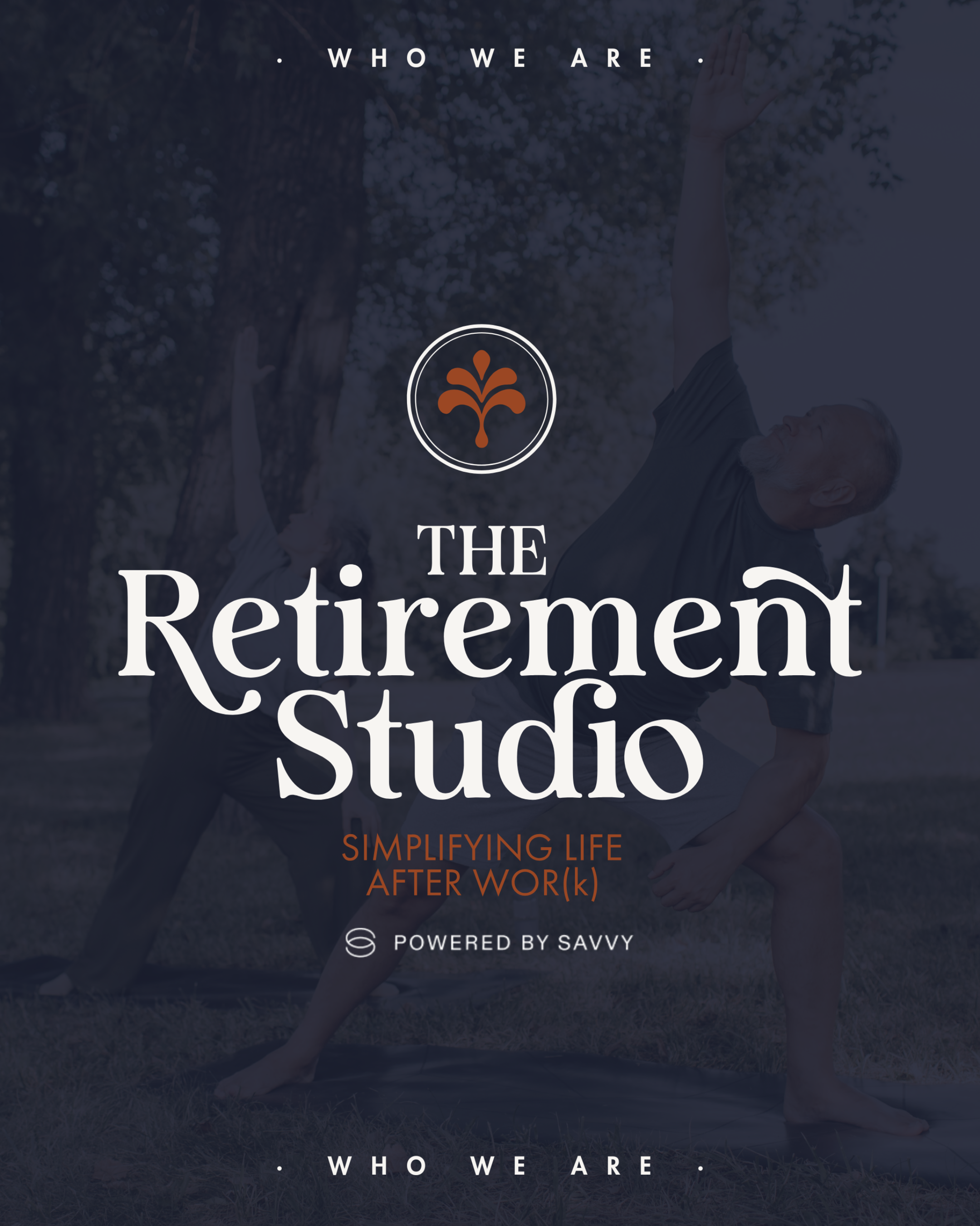
The fountain-inspired emblem became a central visual device, symbolizing growth, renewal, and financial freedom. Its flowing lines reflect clarity and forward movement, reinforcing the brand’s promise without feeling literal or corporate.
The color palette was intentionally layered: sophisticated neutrals like navy and sandstone establish trust and credibility, while accents of sky blue, green, yellow, and red clay bring vitality and optimism. This combination allows the brand to stand out within a traditionally conservative industry without sacrificing professionalism.
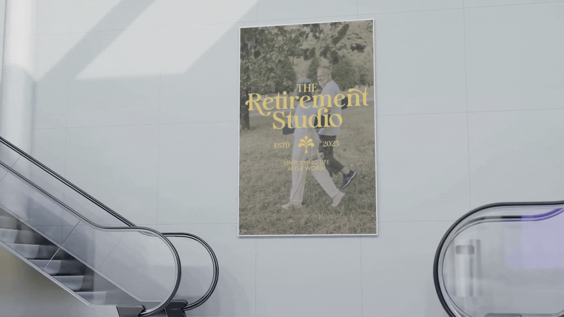
Beyond the logo, the design system extended across marketing collateral, social templates, presentation materials, and digital assets. Every touchpoint was built to feel cohesive—ensuring that whether a client encountered the brand online, in print, or in conversation, the experience remained aligned and intentional.
The result is a visual identity that feels confident, clear, and distinctly modern without abandoning the stability clients expect from a financial partner.

THE RESULTSA brand that differentiates without compromising trust
The Retirement Studio now stands apart from traditional financial firms while maintaining the credibility required in wealth management. The identity communicates clarity and warmth without diminishing authority.
A cohesive system designed for long-term growth
With brand, messaging, and visual identity aligned, the firm has a foundation that supports ongoing marketing, client communications, and future expansion. Every touchpoint reinforces the same message: retirement planning made simple.
A clearer, more confident market position
By bridging professionalism with approachability, The Retirement Studio now shows up as a modern, people-first financial partner. One that simplifies complexity and builds lasting confidence with its clients.
MARKETING CASE STUDY
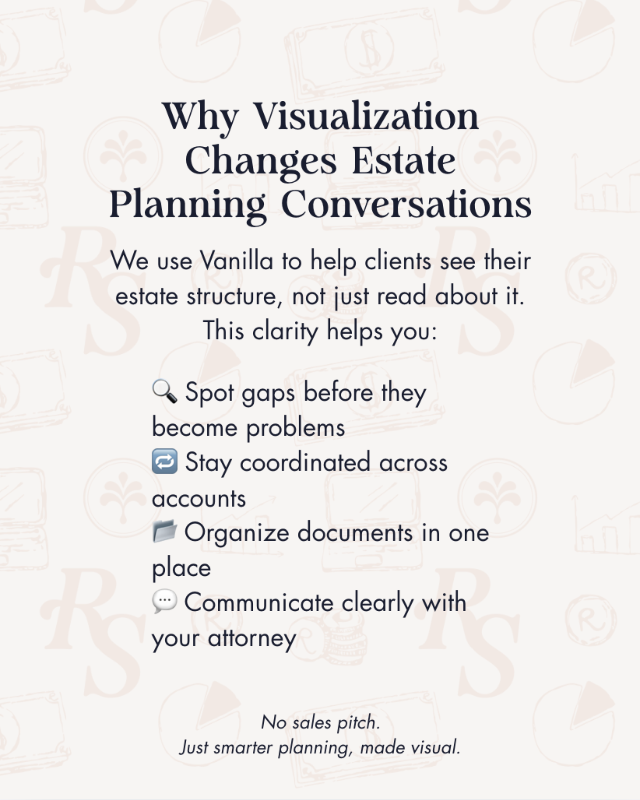
The strategy focused on developing a modern, consistent brand presence across all touch points. This included refining brand messaging, creating professional marketing collateral, and designing presentation materials that made complex retirement planning concepts easier to communicate. In addition, a strategic social media presence was launched to share educational content and position The Retirement Studio as a trusted resource in the retirement planning space.
The results were immediate. Within the first two months of implementing the new marketing strategy, The Retirement Studio experienced a 5,000% increase in social media impressions, significantly expanding brand visibility. The firm generated 585 total engagements, 607 link clicks, and built an audience of 543 followers, demonstrating strong interest in the content being shared.
Most importantly, the improved digital presence translated directly into business opportunities. In just one month, The Retirement Studio received five organic inbound leads through social media, proving that consistent branding, valuable content, and professional marketing materials can drive meaningful growth.
Today, The Retirement Studio has a stronger brand presence and a scalable marketing foundation designed to support continued visibility, credibility, and client acquisition.
*in two months of our partnership
MANAGINGorganic social media management
blog writing
quarterly newsletter
website edits
marketing collateral
on-going strategy
KEY METRICS543 total followers
607 total clicks
5,000% increase in impressions
585 total engagements

Ready to build something intentional?
If you’re looking for clarity, confidence, and a marketing partner who thinks strategically and works thoughtfully, I’d love to connect.